Design school trains you to judge color by eye. That habit does not survive dark mode.
So I rebuilt mine in OKLCH, where lightness steps actually look even. Björn Ottosson designed the space to predict how light and how colorful a color looks to a person.
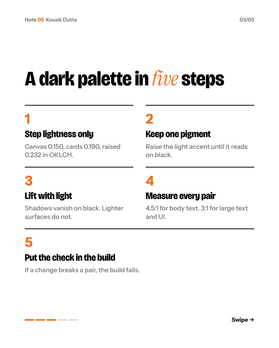
Then I measured instead of trusting myself. Ivory on the canvas: 17.3 to 1. Muted text: 8.4. Cobalt as a link: 7.2. WCAG 2.2 asks for 4.5 for body text.
You do not need to do the arithmetic yourself. Paste this and check what comes back:
Convert my color tokens to OKLCH. Keep each hue fixed, step lightness evenly for
surfaces, and give me a contrast table for every text and background pair, marked
against WCAG 2.2 AA.
You make the taste calls. The agent shows its work. My build now checks every pair, so a future change cannot quietly drop one below the line.
Want it as slides? Download the carousel.
The takeaway
Taste picks the palette. Numbers keep it honest.
Was this useful? Your pick is saved on this device and counted anonymously.