market-lab: every score has to show its doubt
A static research board scoring 1,600+ stocks on India’s National Stock Exchange
A stock screener is dangerous when it looks cleaner than the market it describes. Most screeners let you sort by a number, then scatter the caveats across other columns. I built market-lab to do the opposite. It ranks the NSE, and every row carries the reason to be skeptical.
What the public board shows
1,600+ NSE stocks scored every trading day, from all 2,078 listed. The public board publishes derived scores, ranks and plain-language reasons only. The raw price, volume and deal series stay private, and it gives no horizon or position-sizing advice. An independent project, not affiliated with or endorsed by NSE, BSE or NSE Indices. It is research and education, not investment advice. The screenshots below show the board as I first built it.
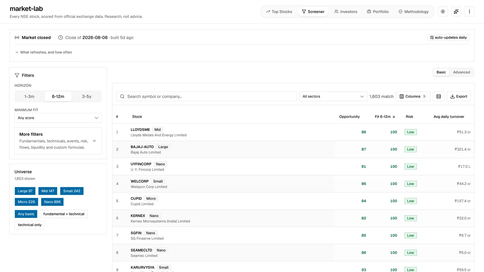
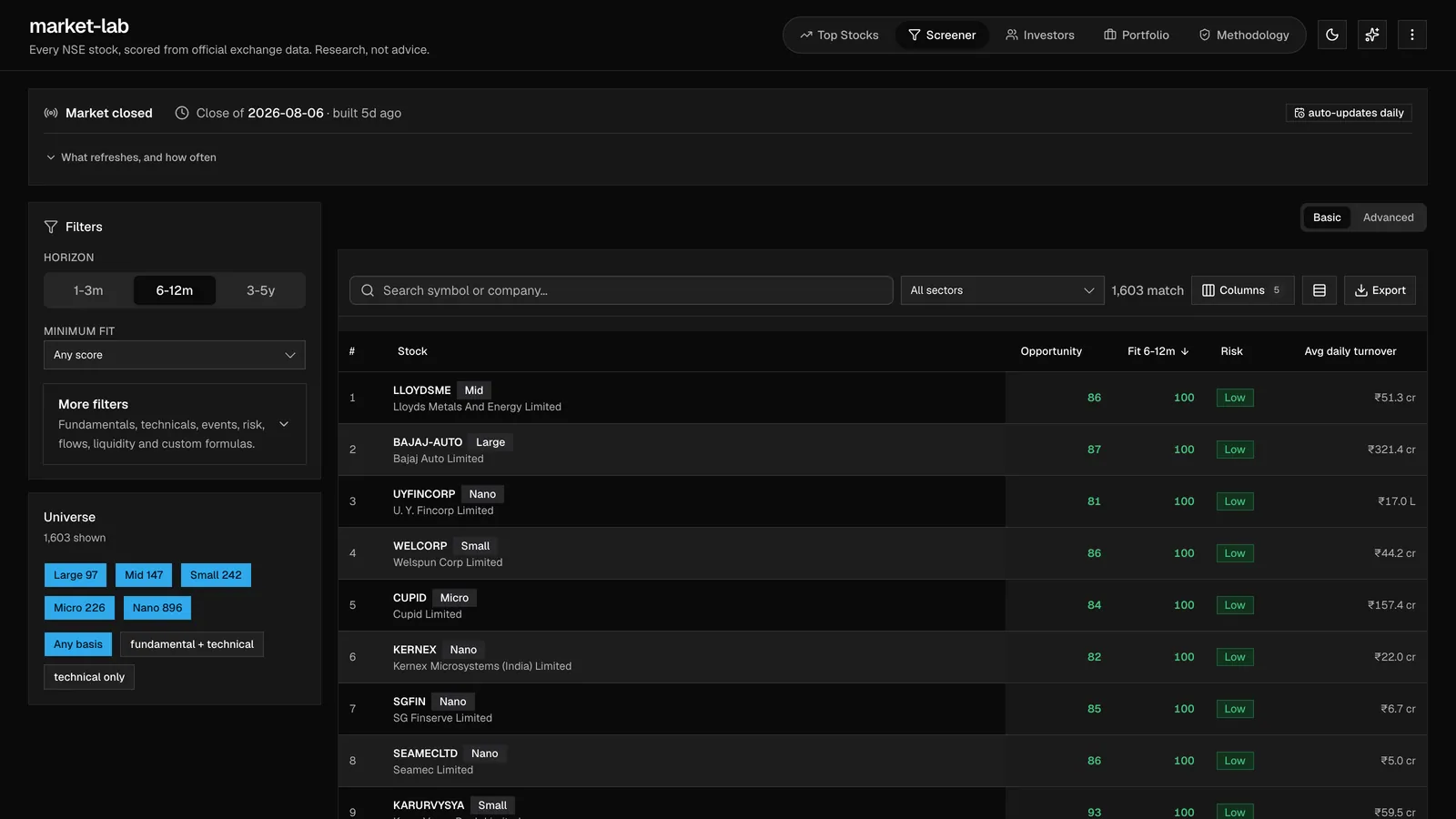
The data was fine. The reading wasn’t.
Screeners don’t lack data. They present it as if you already know how to weigh it. A high score can hide bad liquidity. A tempting small cap can be impossible to enter cleanly. A short-term signal can read like a long-term thesis. The interface had to make those mistakes harder to make.
- Leads with a sortable number
- Treats liquidity as secondary
- Hides the counter-case in extra columns
- Leaves you to guess the time horizon
- Pairs every score with its objection
- Shows order impact beside turnover
- Writes the argument in plain language
- Puts the horizon in the row
Interactive preview
Try the score-with-doubt rule
Strong candidate, but the row still carries the strongest objection.
I built the whole stack
I designed and built it as a full-stack static data system: Python pipeline, scoring model, validation step, generated JSON, TypeScript board, light and dark visual system, SEO surface, and scheduled publishing. The interesting design question was what the interface was allowed to imply.
Static was a design decision
I went static because the product doesn’t need a live server to be useful. A scheduled job fetches the market data, computes scores, verifies the output, writes static files, and publishes to a CDN. That keeps it cheap, resilient, and easy to inspect.
- Official exchange data
- Scheduled fetch
- Clean and normalize
- Scoreopportunity, risk, horizon, liquidity
- Verification gates
- Static JSON
- TypeScript board
- CDN publish
| Layer | Design concern | Engineering choice |
|---|---|---|
| Data | Stale or malformed rows never become confident UI | Normalize the exchange feed before scoring and publish only generated data |
| Scoring | No single magic number pretending to be truth | Calculate several signals and show the weakest next to the strongest |
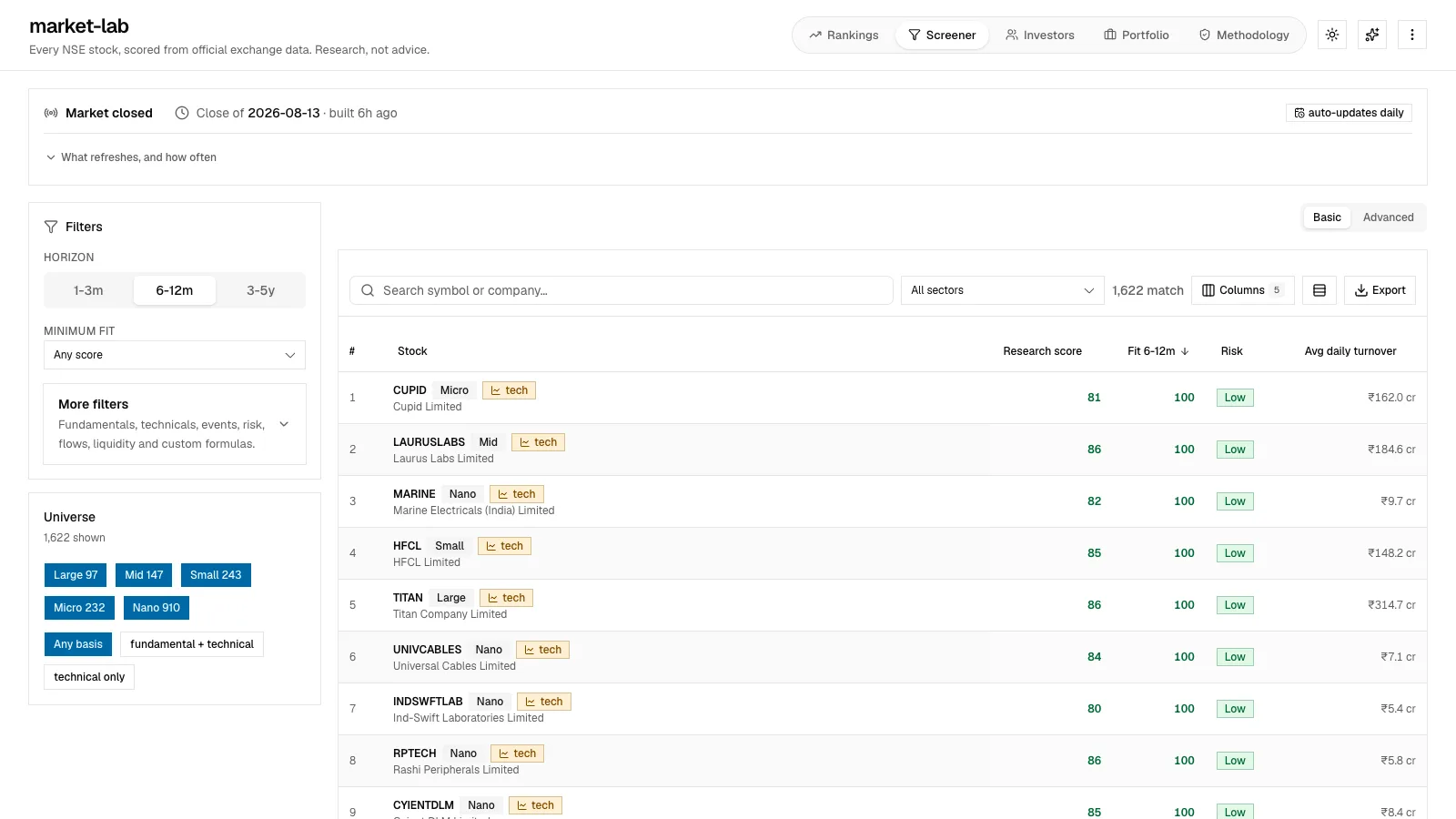
| Interface | Fast comparison without hiding risk | Dense rows with score, risk, turnover, impact, horizon, and thesis together |
| Delivery | Keep the public product cheap and durable | Static files on a CDN, no always-on app server |
The row is the product
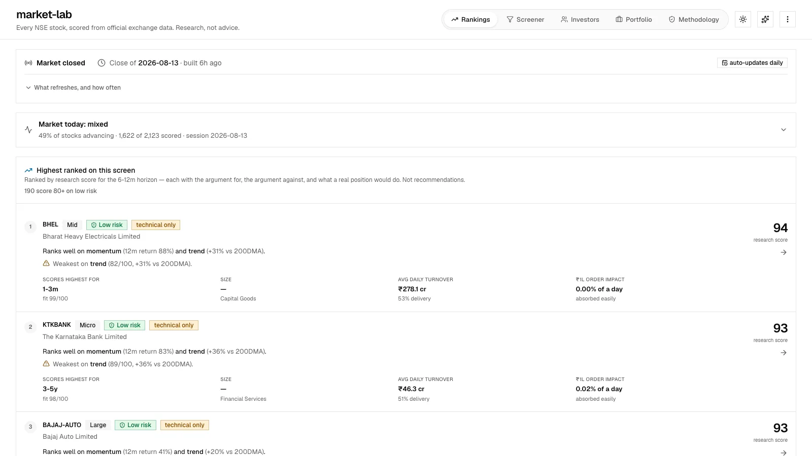
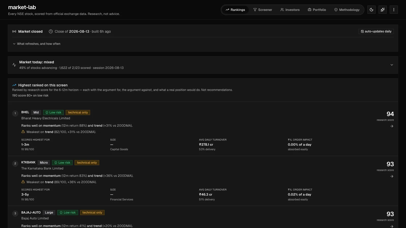
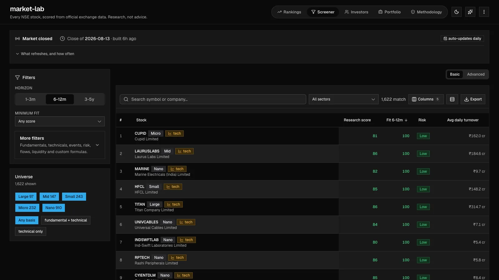
The hardest call was resisting the detail-page instinct. In a financial product, burying the caveat is the same as deleting it for most people. So the row carries the full minimum argument: ticker, score, risk, horizon, turnover, order impact, the case for, and the case against.
This row is where design and engineering meet. The pipeline has to produce the fields. The TypeScript model has to keep them. The UI has to keep them aligned. And the visual system has to make the warning readable without turning the board into an alarm panel.
The warning survives the phone
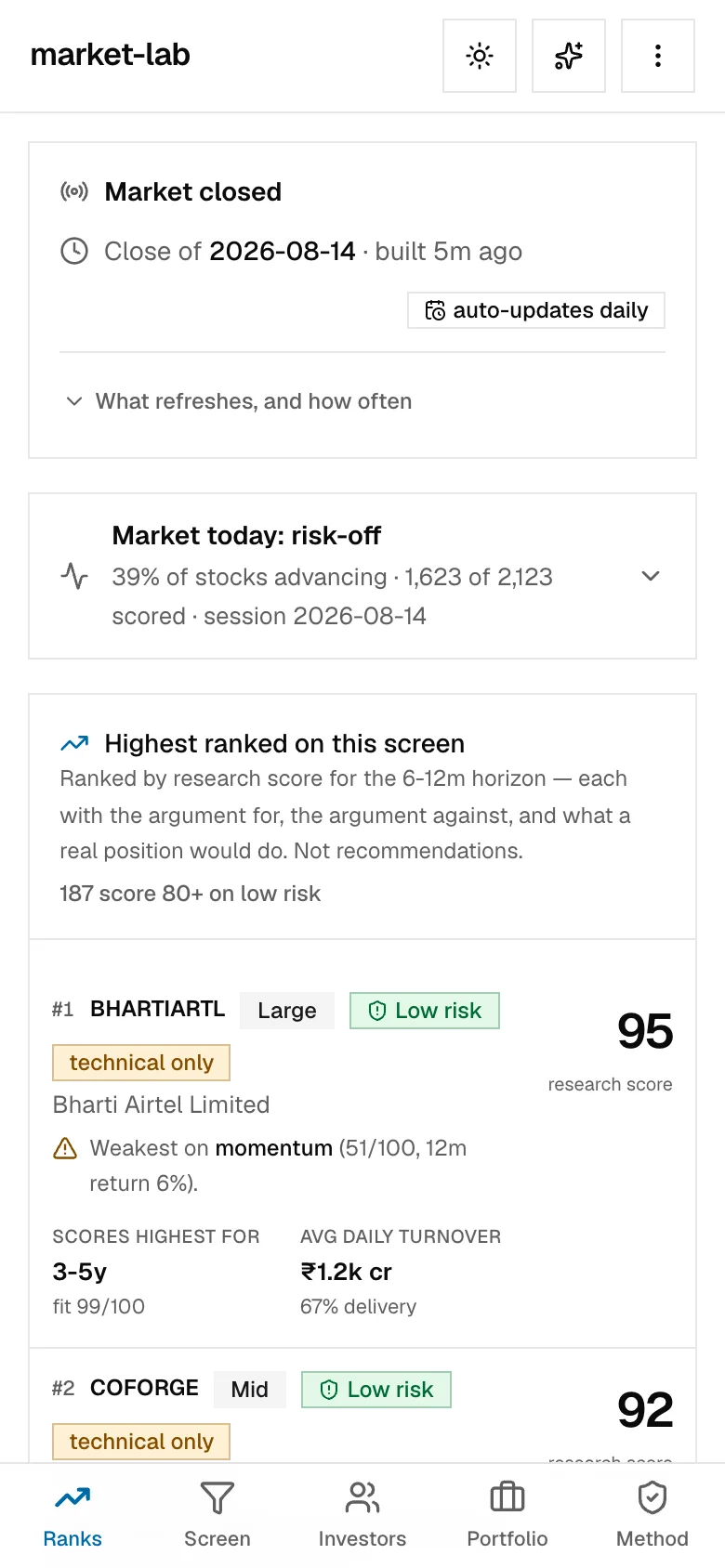
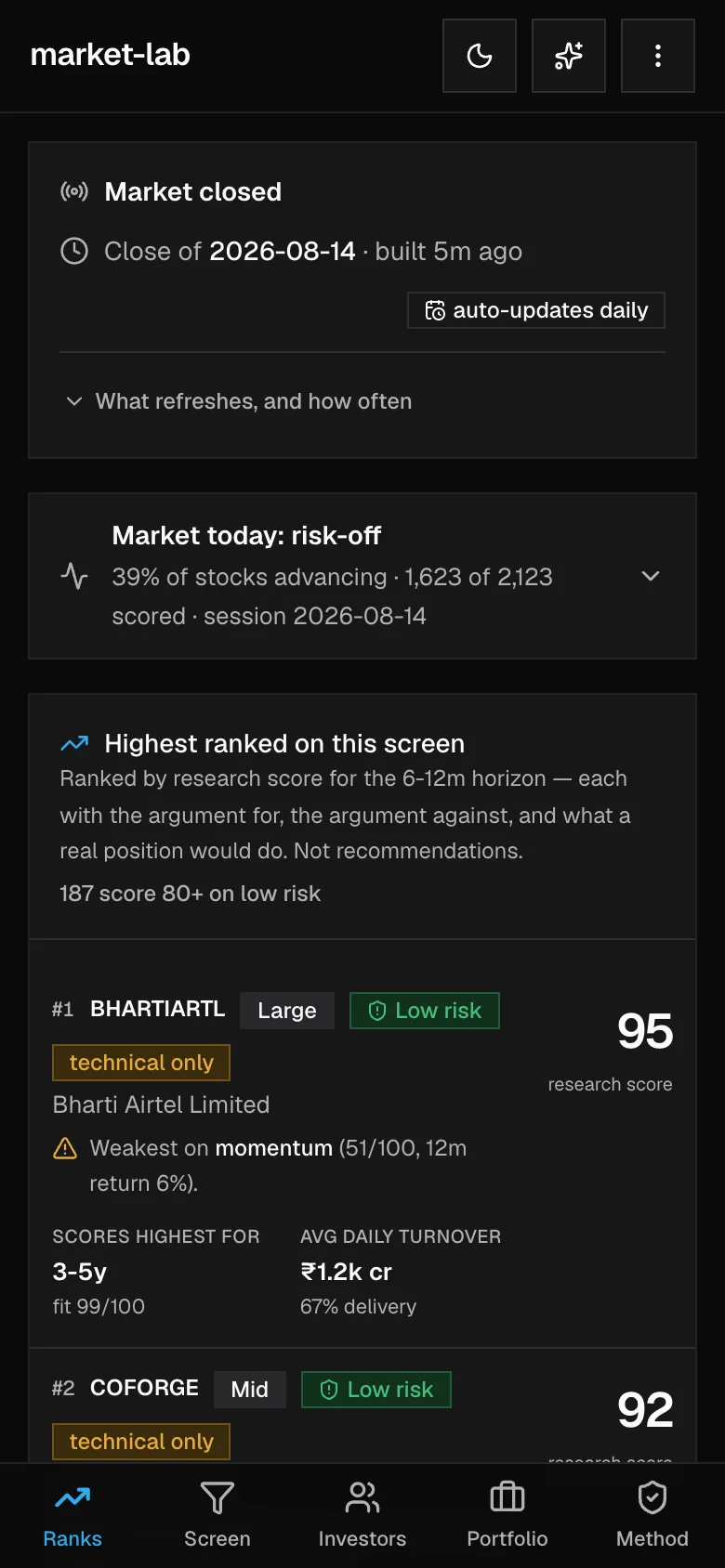
The mobile problem wasn’t fitting a desktop table on a phone. It was keeping the minimum responsible argument once side-by-side comparison was gone. On desktop, a row is for scanning across stocks. On mobile, each row becomes a research card: name and score first, the thesis and the weakest signal together, then the rest of the evidence in a deliberate order. Nothing that matters for safety hides in an overflow menu.
| System rule | Desktop expression | Mobile expression |
|---|---|---|
| Score never travels alone | Score, thesis, weakness, horizon, and liquidity line up in one dense row | The card keeps score, risk, thesis, and weakest signal above the fold |
| Navigation stays available | Research destinations use the wide application shell | Five primary destinations become a persistent bottom bar within thumb reach |
| Status stays in context | Session freshness and market breadth sit above the ranking table | Status becomes stacked disclosure cards that keep their labels and tap targets |
| Themes keep the hierarchy | Color tokens separate surface, data, and warning roles | The same semantic tokens hold contrast without changing the information order |
Mobile is a set of decisions
Good responsive work isn’t a polished desktop plus a media query. It’s deciding what may collapse, what must stay visible, and how navigation changes with reach, then encoding those calls once so every generated row behaves the same.
How I kept the score honest
| Signal | Why it exists | How it appears |
|---|---|---|
| Opportunity score | Gives research a starting order | Big enough to scan, never alone |
| Risk band | Stops a high score from feeling good across the board | A chip next to the stock name, not buried at the end |
| Liquidity and order impact | Shows whether a real position can get in without moving the price too much | Shown as practical rupee-order context |
| Argument against | Forces the product to say why the score might mislead | Written next to the positive thesis in plain language |
See every screen, failure state, and accessibility checkScreens, failure states, build craft, and accessibility gates
Every screen keeps the same posture
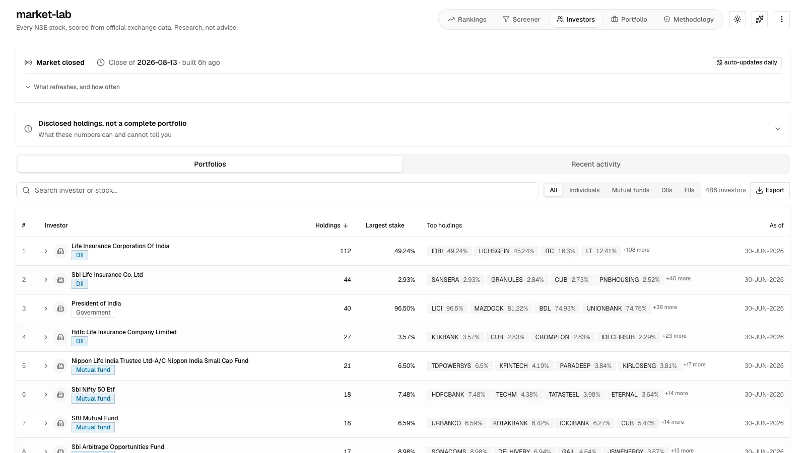
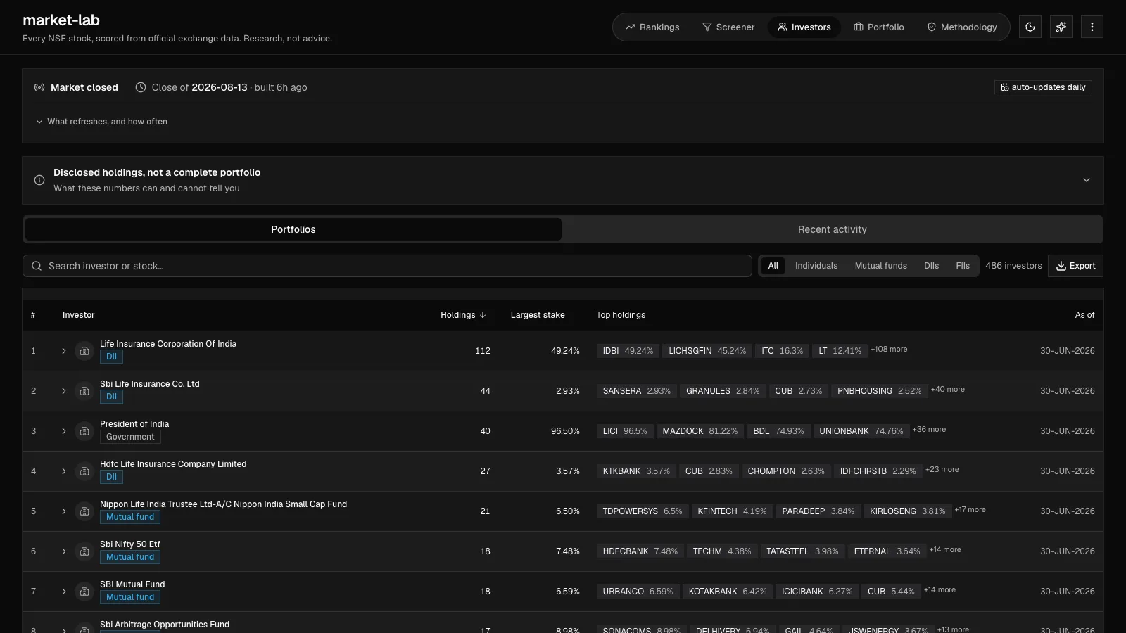
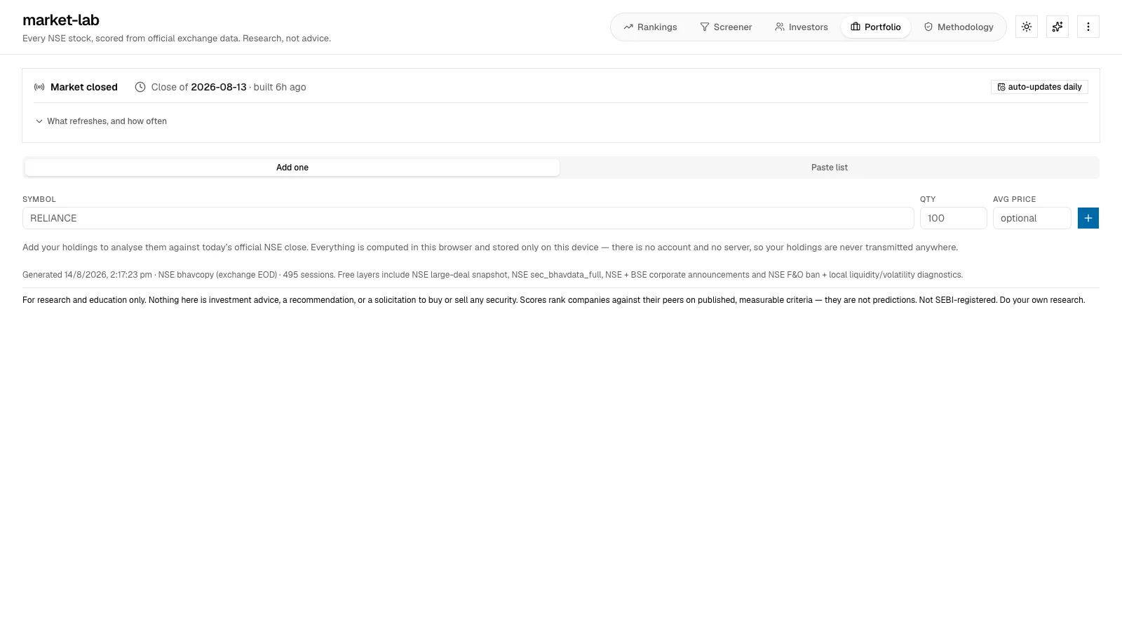
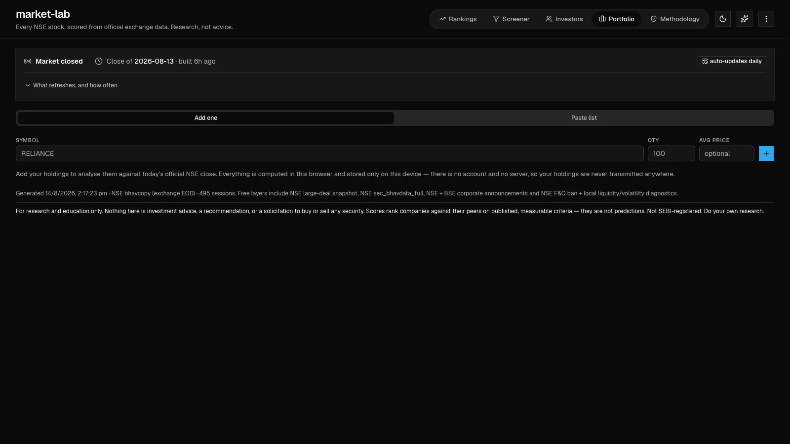
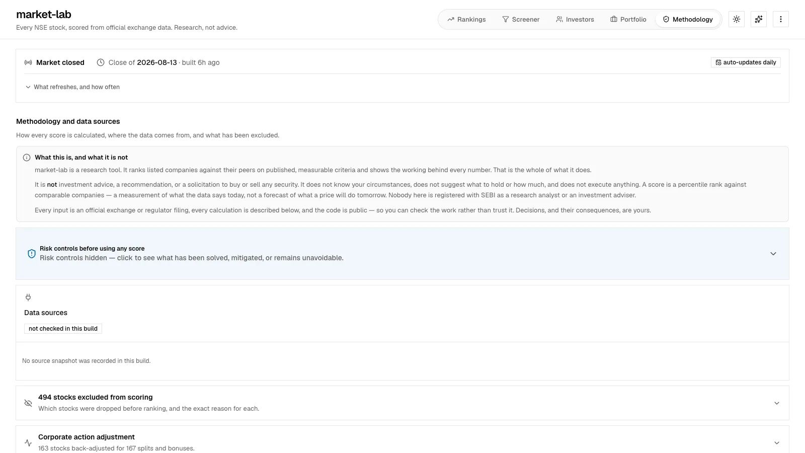
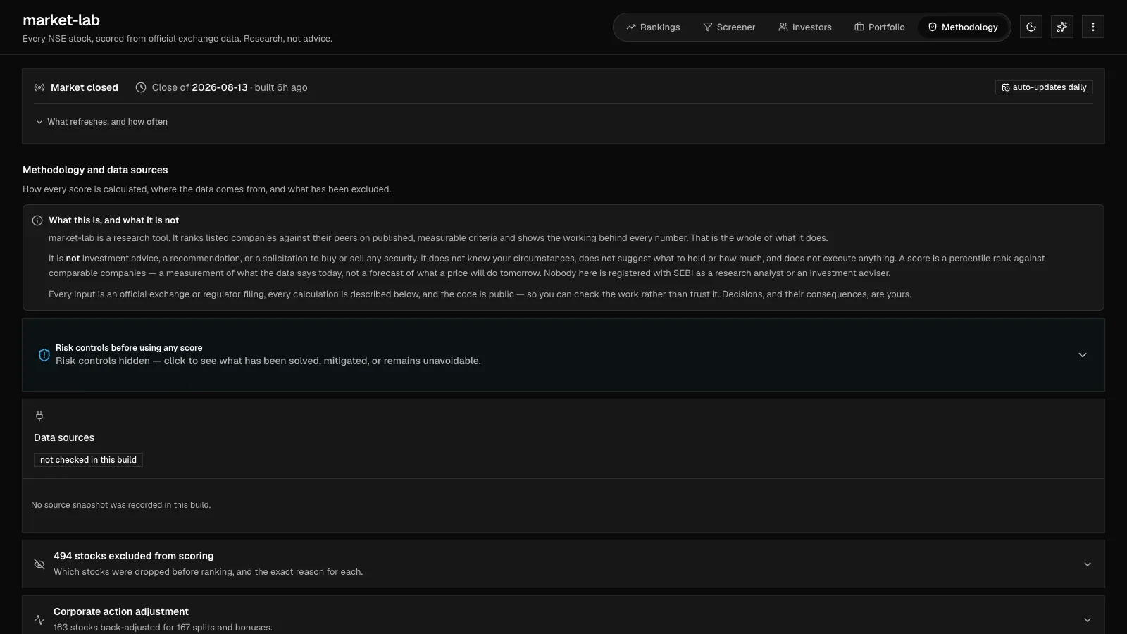
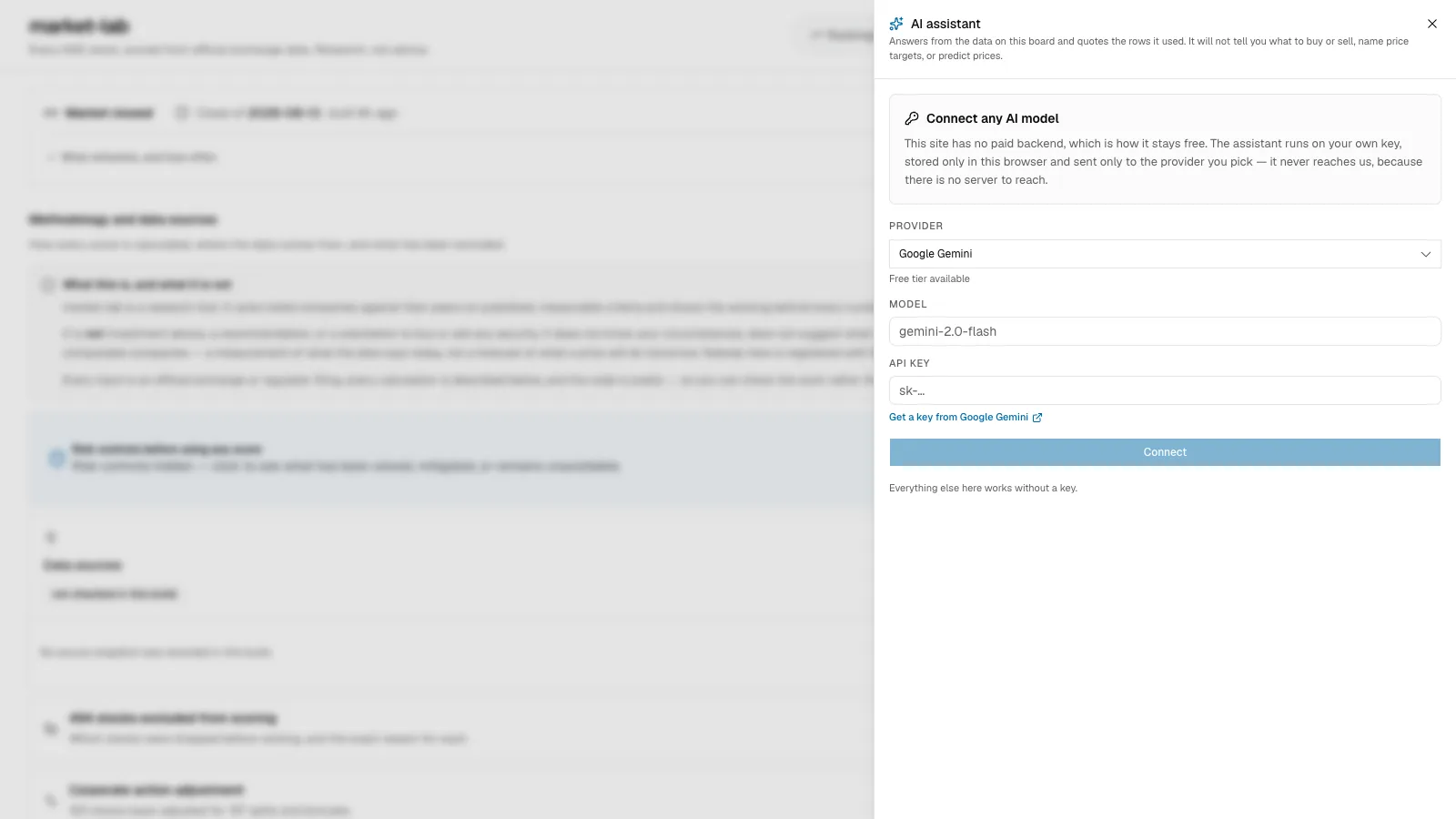
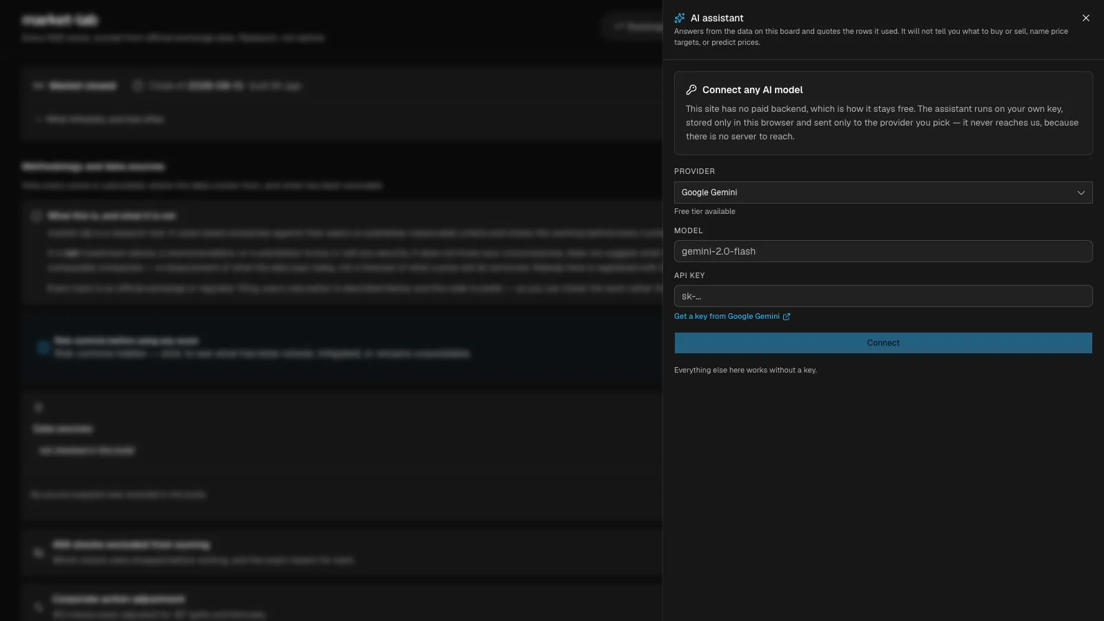
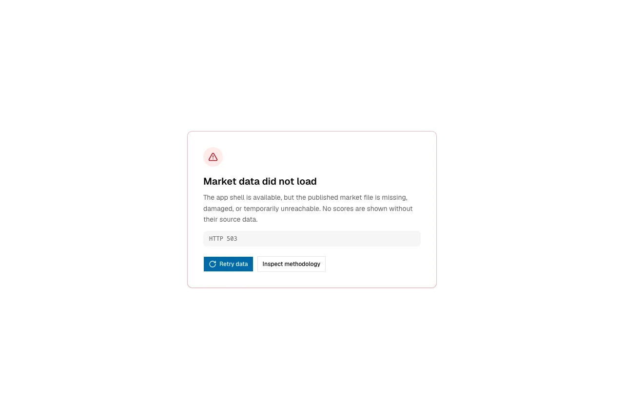
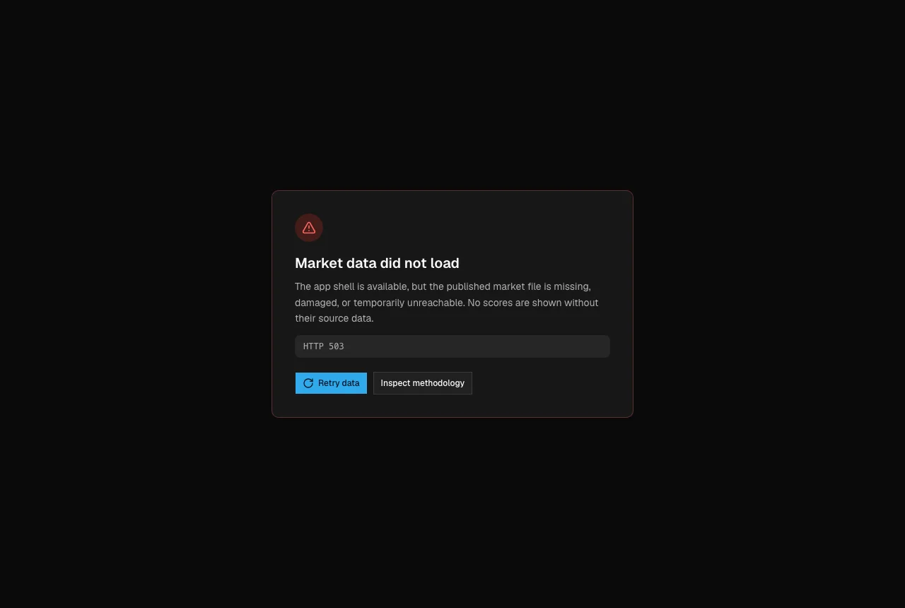
Missing data never looks like weak data
A research product turns dangerous when missing data looks like weak data, or when a failed refresh quietly leaves yesterday’s confidence on screen. I put reliability in the shared data layer: malformed numbers become unavailable, duplicate or damaged rows get counted, and a score is suppressed when its risk, liquidity, or horizon context can’t support it.
| Failure class | Unsafe behavior | Designed response |
|---|---|---|
| Initial data failure | Render an empty board or fabricate zero-like values | Withhold scores, show the failure reason, and offer retry plus methodology |
| Background refresh failure | Replace useful context with a generic error | Keep the last-known screen, mark it stale, and let the user retry |
| Malformed or partial rows | Let missing risk or liquidity look neutral | Mark fields unavailable, count rejected rows, and suppress unsupported rankings |
| Restrictive filters | Treat zero results like a system outage | Name the active constraint and give a direct way to clear or widen filters |
| Invalid portfolio or assistant input | Accept a success-shaped answer | Attach the error to the field or request and keep the user’s work recoverable |
Missing means less confident
Missing context lowers confidence. It never turns into a reassuring zero, a complete-looking row, or a score the evidence can’t support.
The table is the last mile
The table is the last mile of a whole system: generated data, typed fields, sorting, responsive density, contrast in each theme, static routing, and public deployment. I worked every part of it: product judgment, interaction design, semantic visual tokens, TypeScript, pipeline verification, and running cost. A row that looks clean but drops a warning on mobile is a product failure, not a CSS bug.
Accessibility gated the release
The accessibility sweep covered every primary view, factsheets, assistant setup, both themes, and the loading, empty, degraded, and error states. I fixed landmarks and headings, linked labels and errors, made rows activate from the keyboard, kept focus visible and restored it, fixed disclosure semantics, announced live status, wrote text alternatives for financial signals, added reduced motion, communicated risk without relying on color, and made narrow screens reflow.
| User need | Implementation evidence | How I checked it |
|---|---|---|
| Understand status without color | Risk and quality use text, icons, and semantic labels as well as color | Light and dark contrast checks plus non-color state inspection |
| Operate the board without a pointer | Rows, filters, disclosures, factsheets, and assistant controls have keyboard semantics | Tab order, focus visibility, Enter and Space activation, and focus-return tests |
| Hear updates and errors | Loading, result counts, assistant responses, and failures use the right status or alert behavior | Automated role and name checks plus inspection of the critical live regions |
| Zoom or use a narrow viewport | Cards reflow without two-way page scrolling and primary controls keep usable targets | 320, 390, and 430 pixel viewports plus 200%-equivalent reflow |
One rule, everywhere
No number travels without context. If a score can’t bring its risk, liquidity, and counter-argument along, it doesn’t get to be a primary decision point.
What this proves, and what it doesn’t
I built this alone, so the evidence is ownership end to end: model rules, data boundaries, responsive interaction, accessibility, recovery, tests, and deployment. It says nothing about team leadership, and the rankings say nothing about investment returns. Judge it on research quality: how fast you can compare a shortlist, whether you notice the counter-argument, how it recovers from stale or failed data, and whether confidence drops when the evidence is incomplete.
What I’d build next
Next, I’d make score movement easy to audit over time: a change log for why a score moved after each trading session, the raw fields behind every final judgment, and structured testing across several screen-reader and browser combinations.
The takeaway
market-lab’s quality lives in the seam between the model and the interface. The score, the pipeline, the themes, and the row layout all enforce one principle: help people research faster, and never let speed turn into false confidence.