job-lab: I needed judgment, not more job links
A local-first job-search desk for a senior designer applying from India: private, with a public demo
The first idea was a job board: collect UX design roles, show them on cards, link out to the posting. I was the user, and that was not what I needed. I never ran out of job links. I ran out of hours: working out which roles were real, whether remote included India, what the application should say, who to write to, and whether the market was teaching me anything back.
Private desk, public demo
The real desk is private and stays behind a login. The public demo runs on fictional data, so you can try every screen. Try it at job.kousikdutta.com/?demo=1.
Volume was never the problem
Most job products optimize for volume: search, save, apply. That falls apart for a senior designer in India looking for roles worth a careful application. Finding roles was never the hard part. Judging them, with half the information missing, was.
| User problem | Design response | Engineering response |
|---|---|---|
| Remote does not always mean remote from India | Split remote, hybrid, onsite, and city roles instead of flattening them into one list | Normalize location text into workplace, city points, and eligibility flags before anything renders |
| A match score alone does not tell me what to do | Rename the score Worth your hour and tie it to the next action | Combine role fit, freshness, application readiness, resume evidence, and human-route signals |
| Most ATS advice is vague or dishonest | Suggest rewrites only where the resume lacks truthful evidence | Compare posting language against the resume, portfolio projects, and saved profile data |
| Networking turns into spam fast | Design outreach as a decision, not a send-more button | Build templates from the role, the company, hiring-team clues, and portfolio proof |
I designed it, built it, and tested it
I designed and built it end to end: source model, scoring logic, board IA, map interaction, ATS packet workflow, local storage, theme system, and validation scripts. This is the work I love most. A design decision doesn’t stay a note in Figma. It becomes a typed model, a component, a route, a test, and a build artifact.
The architecture is the strategy
I split it into three layers. The source layer reads public postings and cleans them into one consistent job object. The decision layer scores fit, effort, readiness, and access to a real person. The interface layer turns those signals into a board, a detail view, an apply packet, and a loop that learns.
That loop set the UI structure. The board is for triage. The detail view decides whether a role gets the hour. The apply packet shapes the evidence. The tracker checks whether the advice is actually working. Four views, four jobs, so each one gets its own density.
The board is for triage
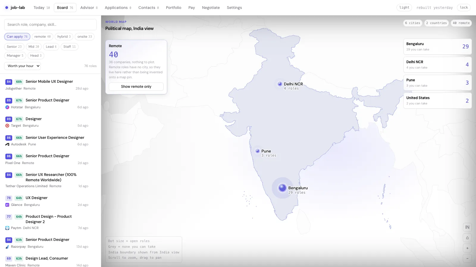
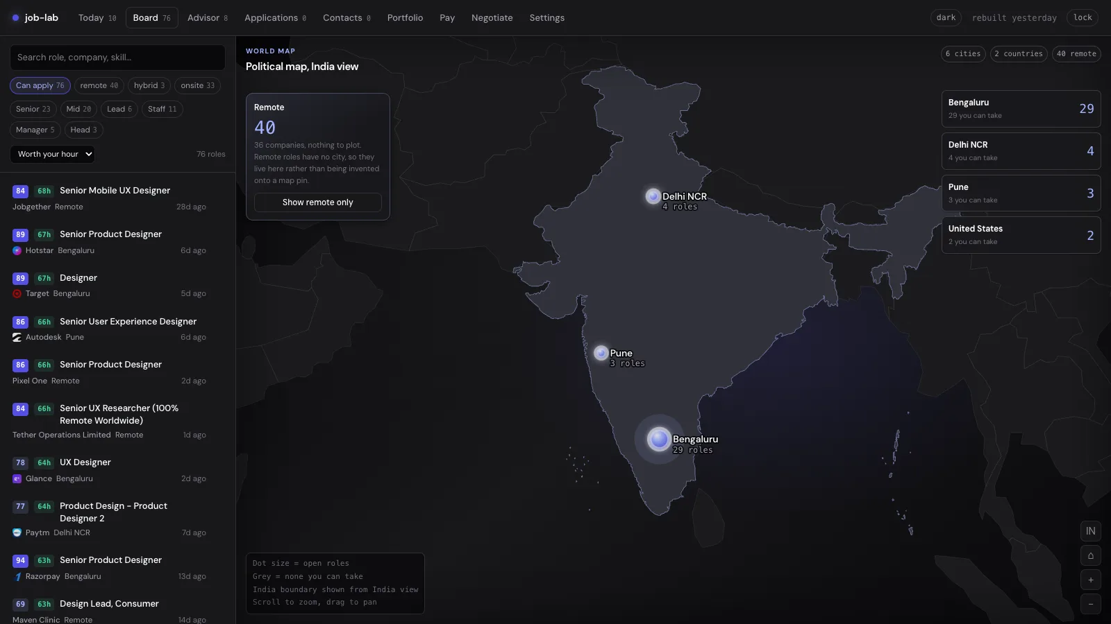
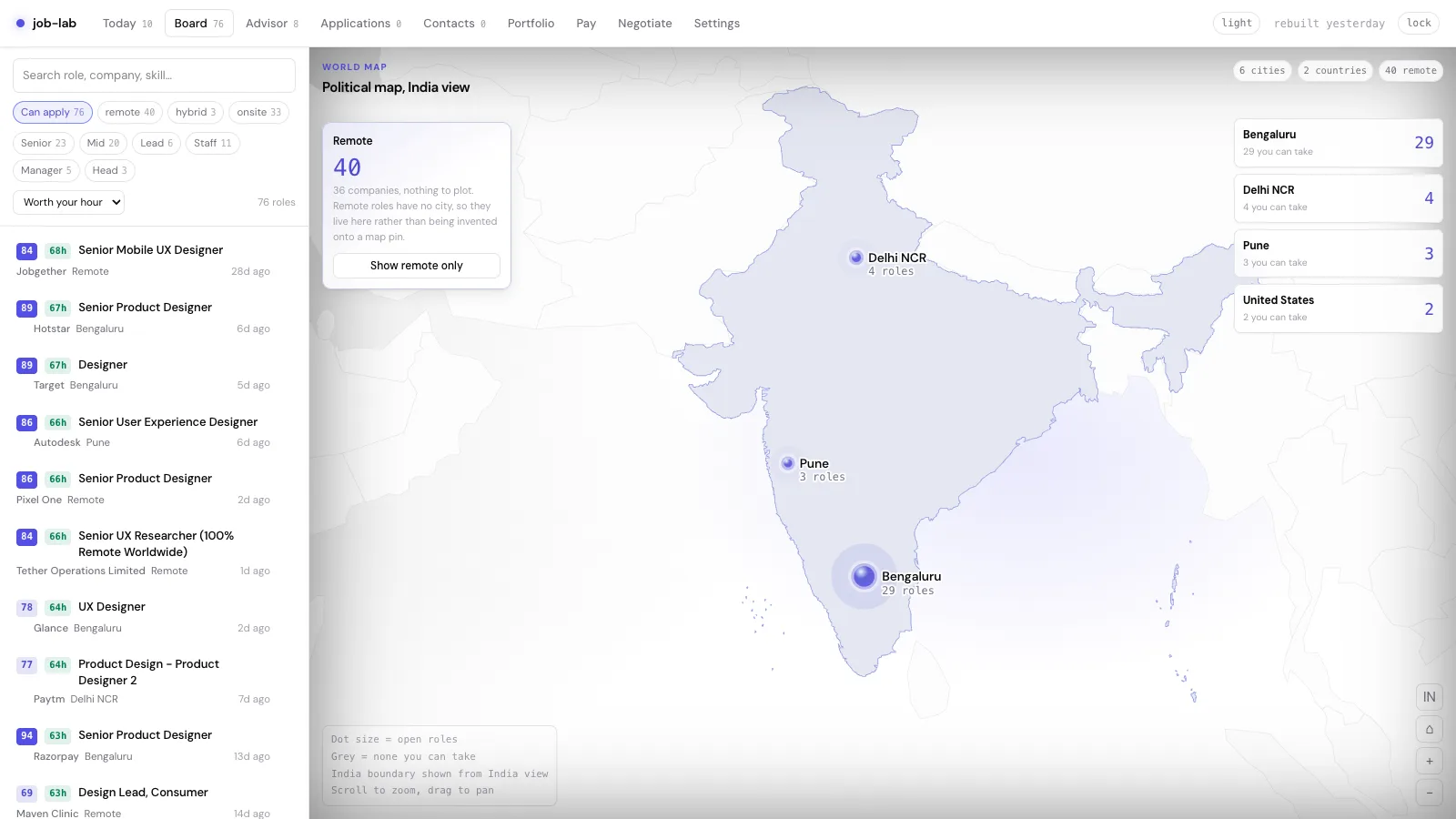
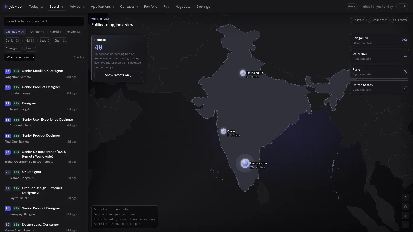
The map got pushback, and it deserved it. The first version was decoration, and its India boundary was not acceptable for the context. I replaced it with an accepted world political map and made India the default: India’s boundary visible, remote roles counted separately, cities ranked on the right, the ranked application list on the left.
- Decorative geography
- Unclear political boundary
- Remote roles plotted as if they had a city
- No link to the ranked list
- Accepted political map context
- India first, because that is the market
- Remote work counted separately
- Dots, city cards, and jobs all agree
Interactive preview
Try the Worth your hour model
Worth a look, but fix the resume gate before opening the ATS.
On a phone, the job changes
On desktop, comparison is the task, so the ranked list, filters, map, and split-view detail all share one screen. A phone is a different job, so I designed a different composition. Today is the compact starting point. Five daily destinations sit in a bottom bar that respects the safe area. Secondary tools move into a More sheet. Board goes list-first with collapsible filters. Opening a role gives you a focused overlay with a clear way back, not squeezed desktop panes.
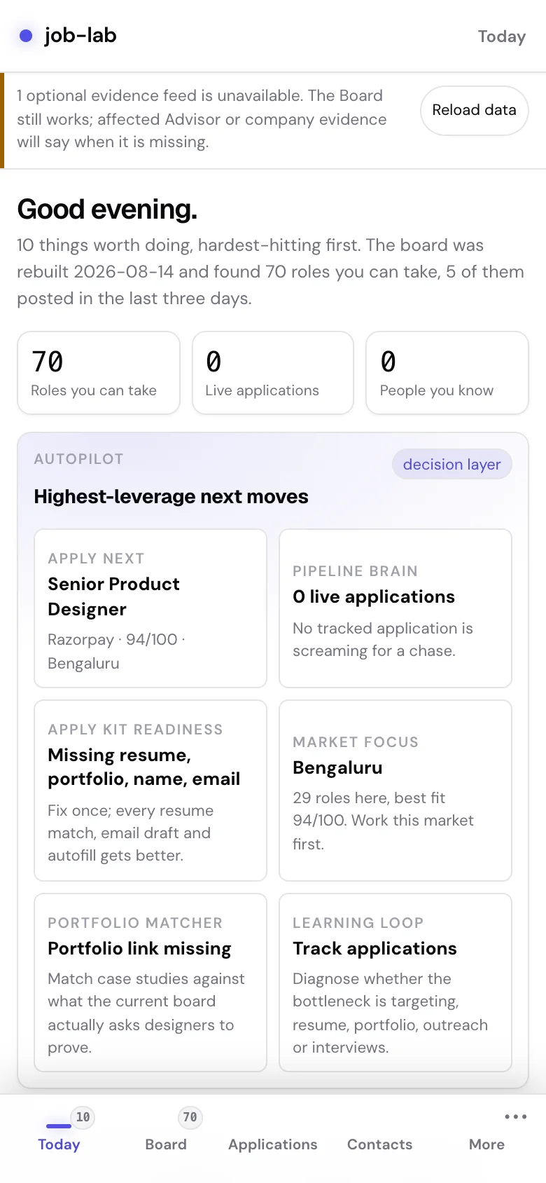
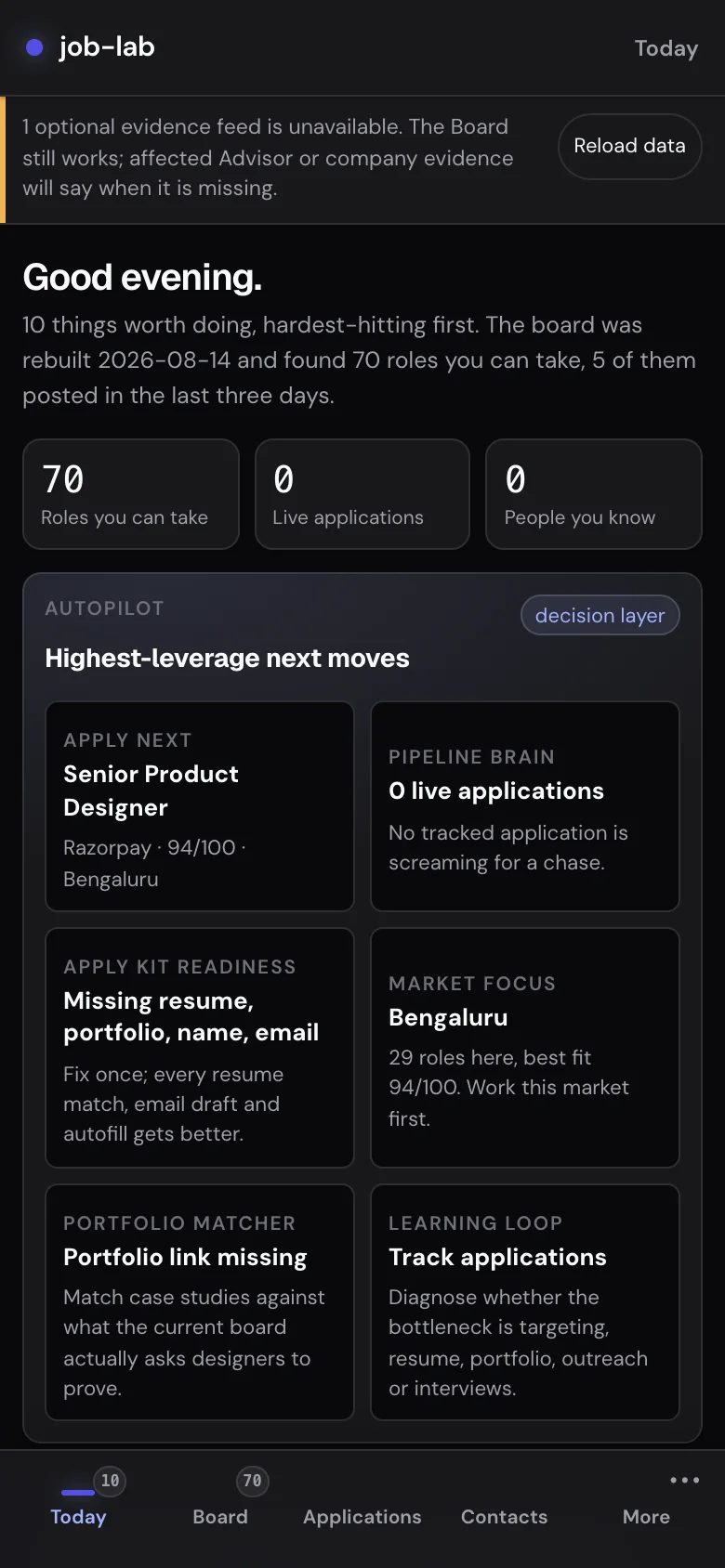
| Product need | Desktop behavior | Mobile behavior |
|---|---|---|
| Choose what to do next | The wide layout keeps several destinations and their context visible | Today leads with the most useful actions and five daily destinations |
| Scan the market | List, map, city summary, and filters share one view | Board goes list-first; filters collapse and the map becomes secondary context |
| Move across the workflow | Every top-level destination stays in the header | A safe-area bottom bar holds daily tasks; More opens Advisor, Portfolio, Pay, Negotiate, and Settings |
| Open a role and return | Detail and list share the split-view space | Detail becomes its own overlay: the content behind it goes inert, context is kept, and Back to roles is always there |
Compact, not cramped
Compact never meant small targets. Controls stay at 44 pixels where precision matters, safe areas are handled, and document overflow is gone. I tested at 320 × 720, 390 × 844 and a 200%-equivalent reflow viewport. Desktop kept its own split view and map.
The apply packet earns its keep
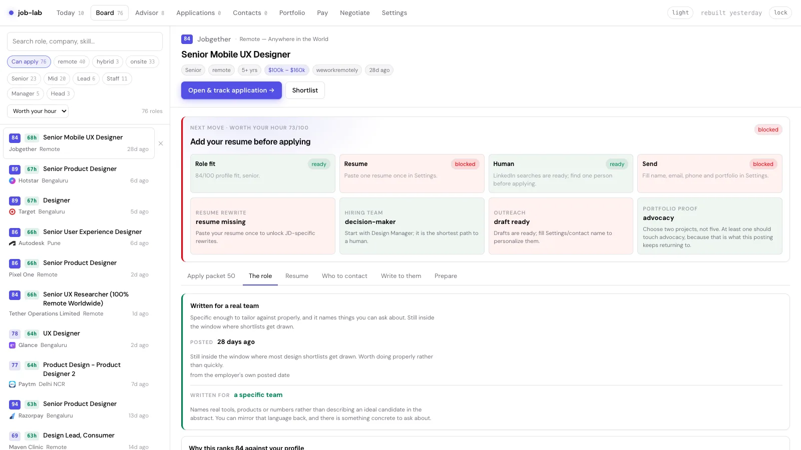
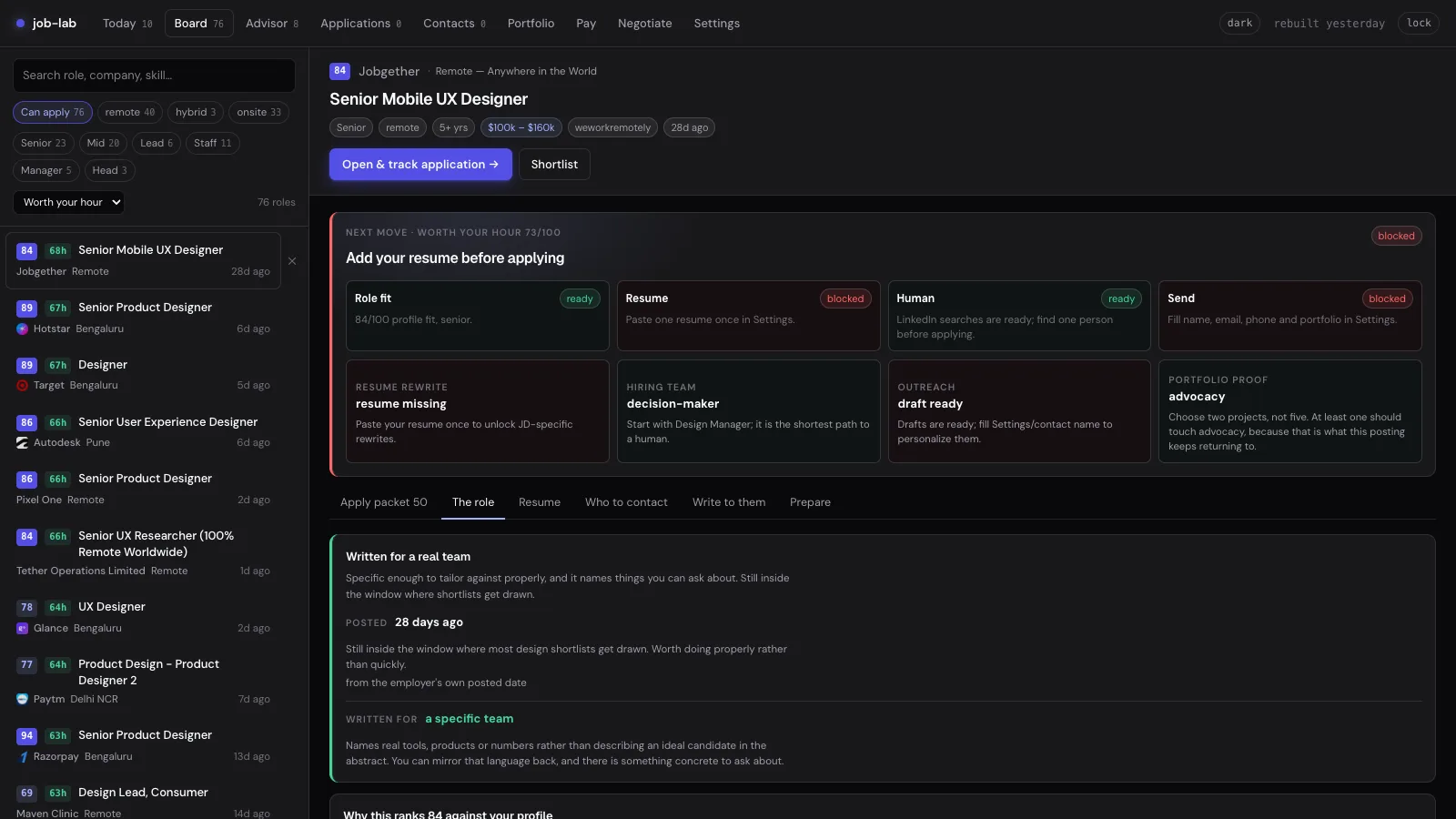
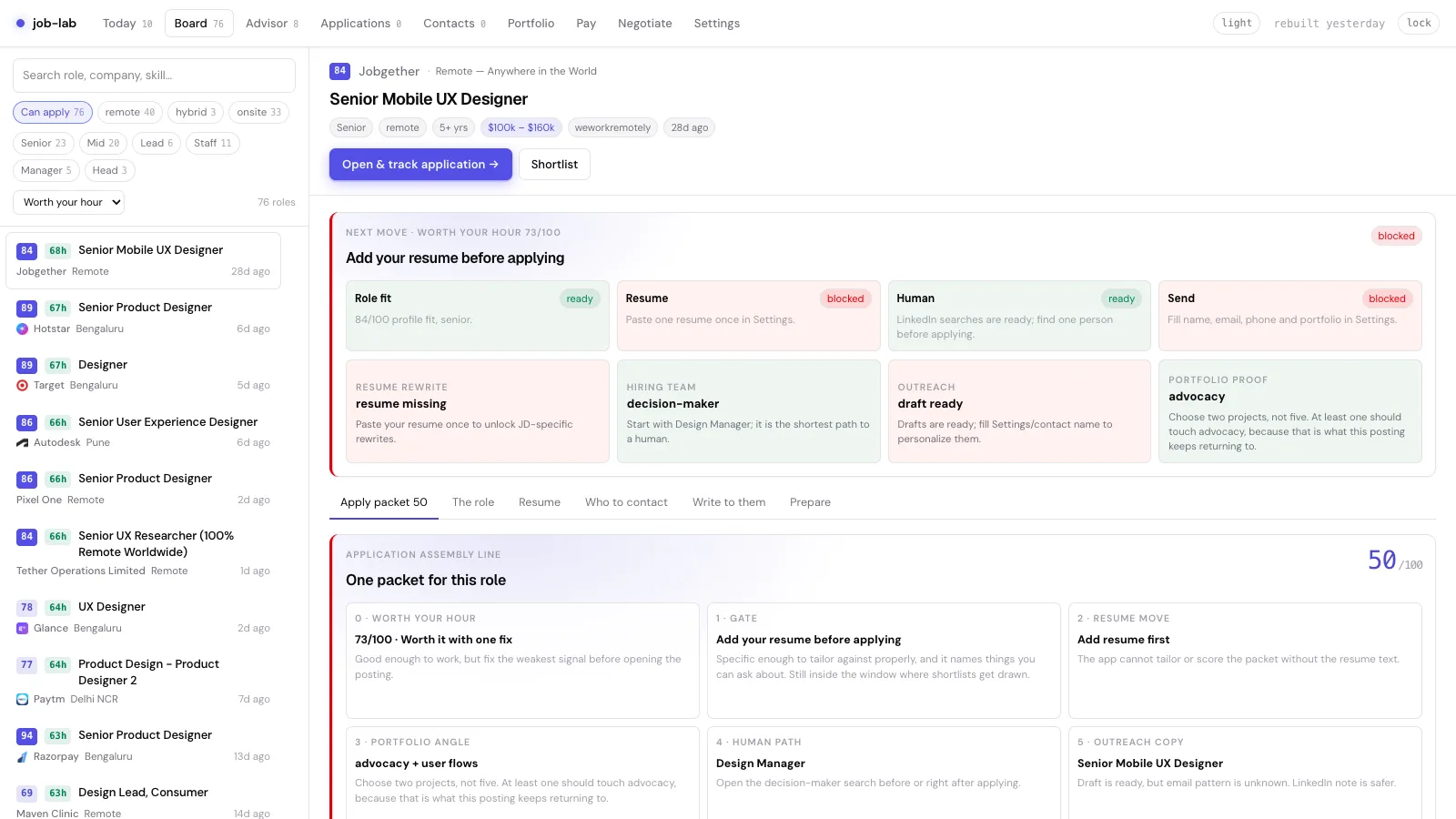
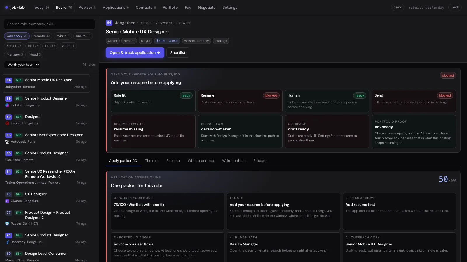
A normal job card ends at the apply link. job-lab starts there. The detail page turns a posting into an application packet: role fit, resume gaps, portfolio proof, a path to the hiring team, an outreach draft, a follow-up plan, and interview prep. I designed it to slow you down before the external apply click, because that is where the quality of an application is won.
| Packet module | Design decision | Engineering detail |
|---|---|---|
| Resume match | Show missing evidence and honest rewrites, never fake ATS hacks | Compare JD terms, seniority, and proof points against the stored resume text |
| Portfolio proof | Ask for the two projects that answer this posting, not five random links | Match job keywords to saved project themes and generate a short pitch angle |
| Who to contact | Replace “go network” with a specific route to a person | Use public company and team clues, with a manual review every time |
| Write to them | Specific enough to be useful, restrained enough to be ethical | Built from role context, profile data, and the portfolio URL, not generic AI prose |
Interactive preview
Try packet readiness
Profile fit and seniority match the posting.
Paste your resume once in Settings.
Two case studies map to the role.
Find one person before outreach.
Name, email, and portfolio URL are ready.
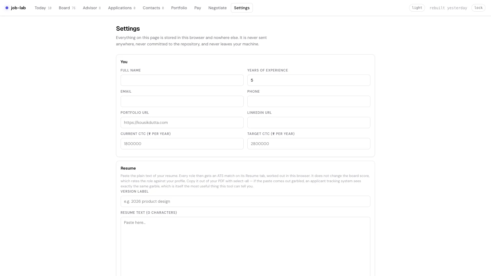
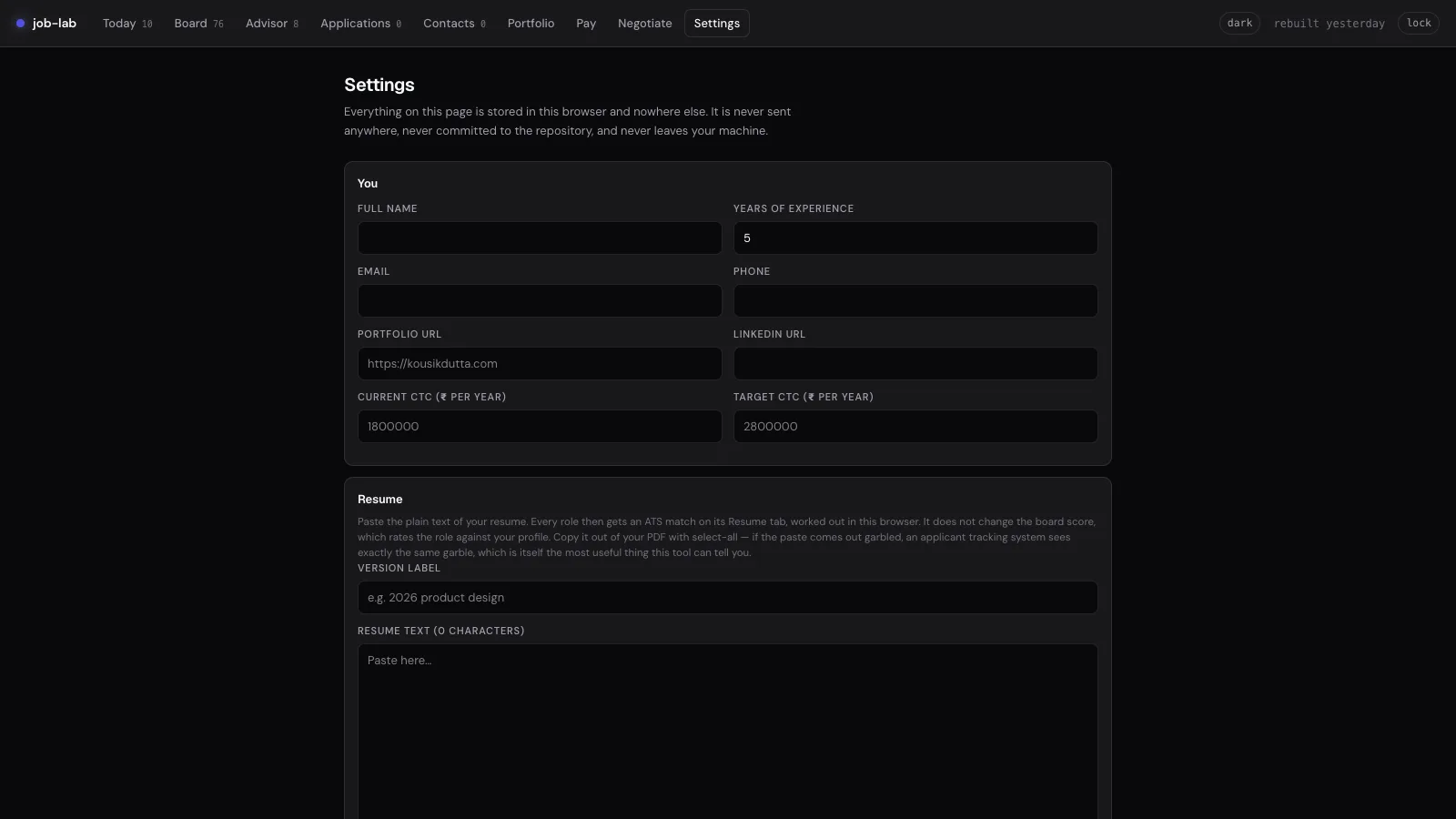
See every screen, failure state, and testEvery screen, recovery states, accessibility structure, and test coverage
Every screen has one job
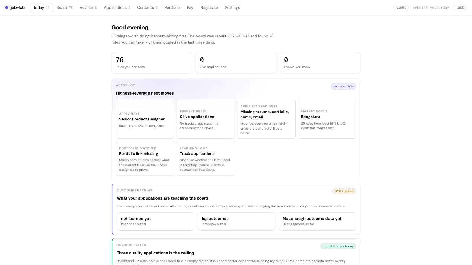
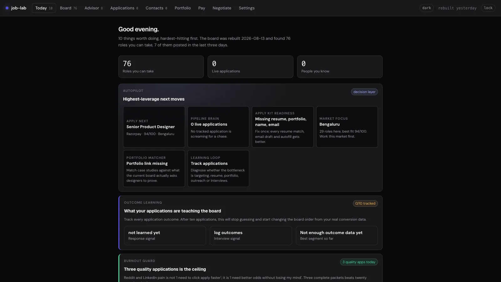
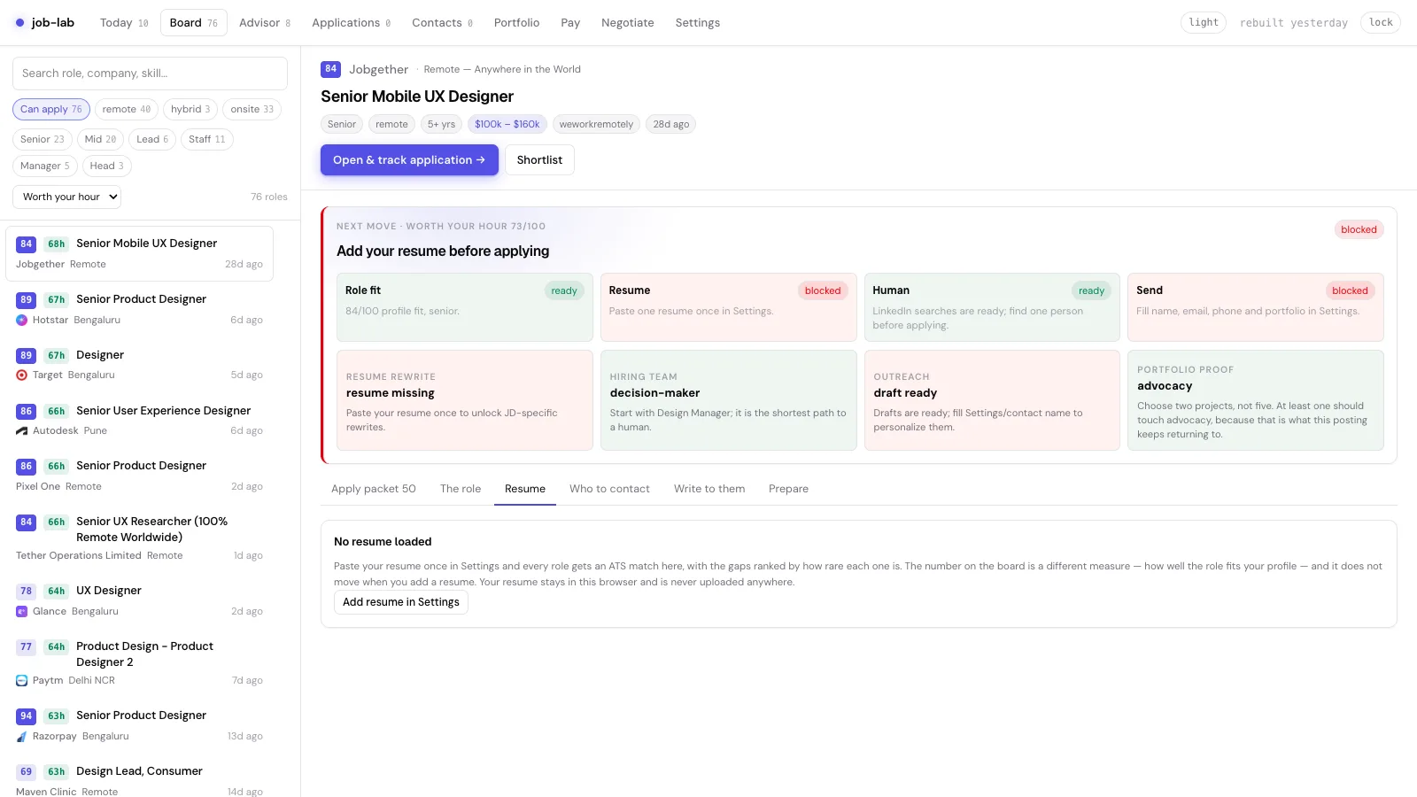
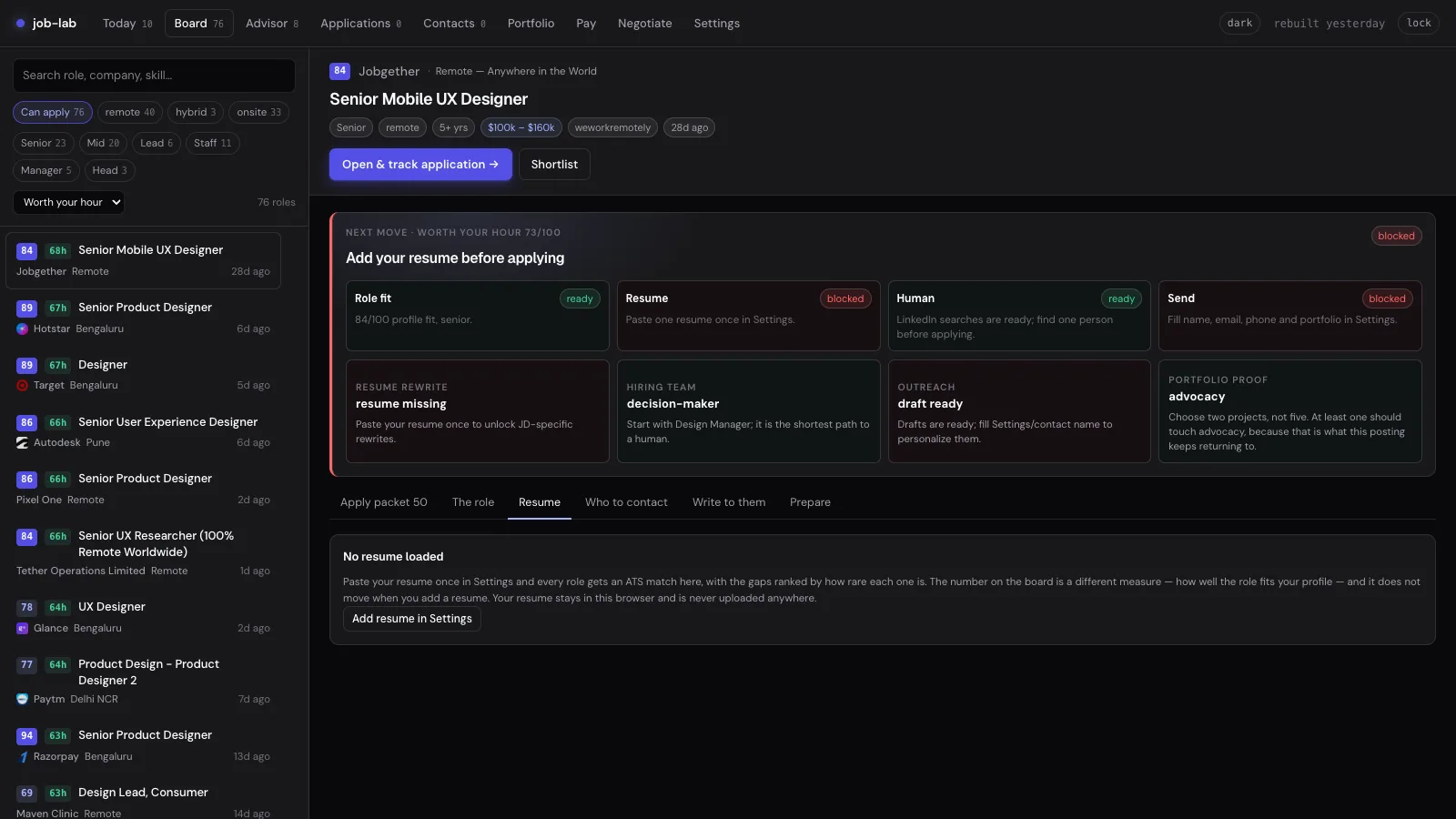
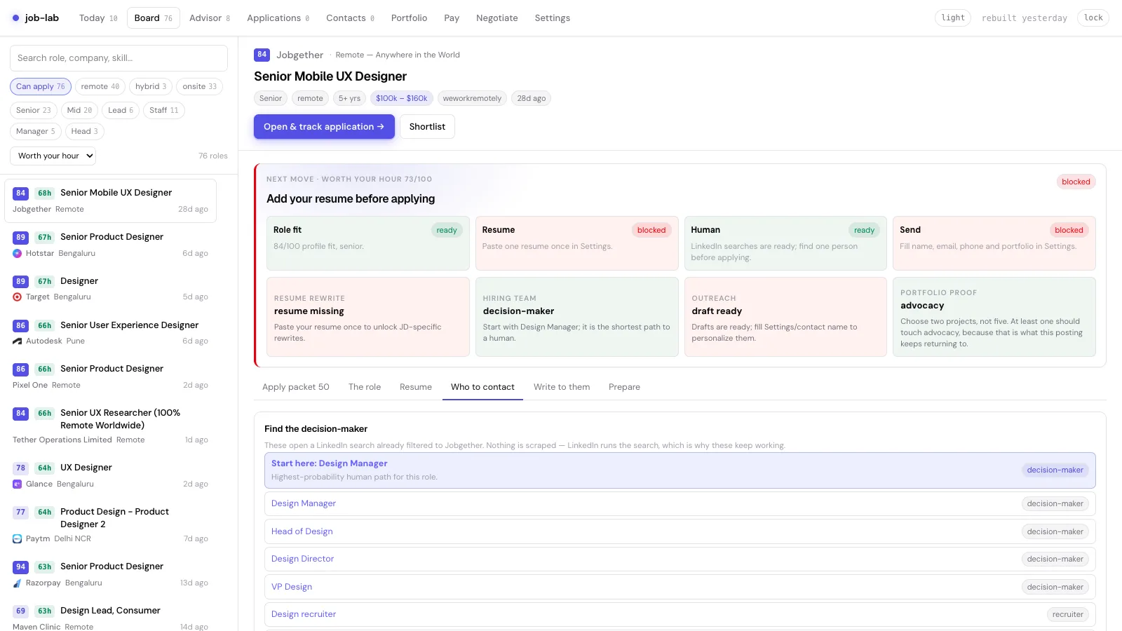
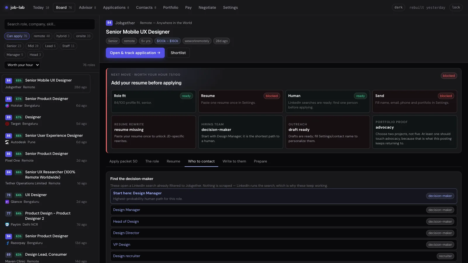
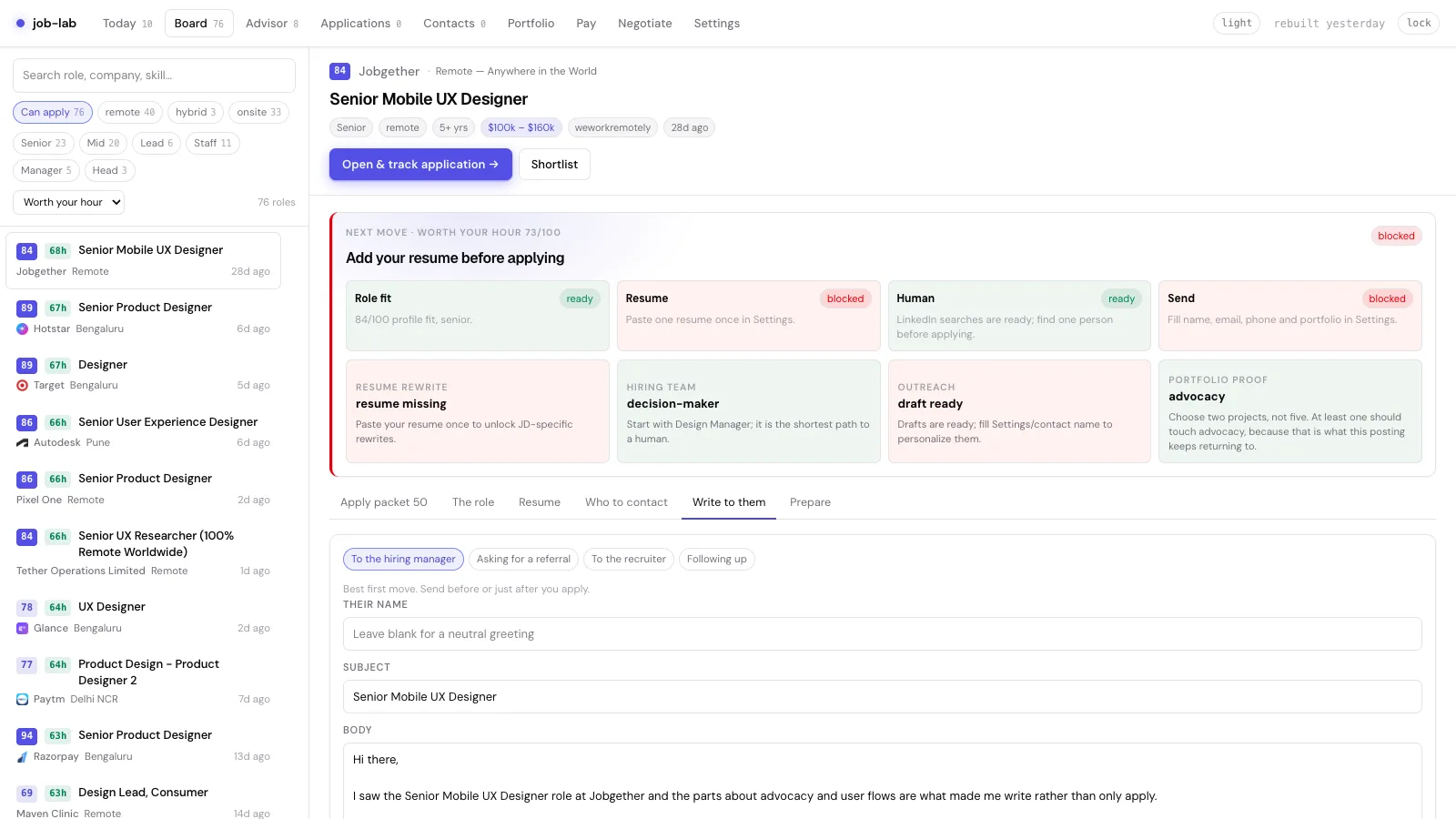
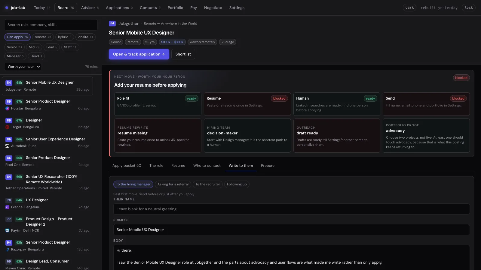
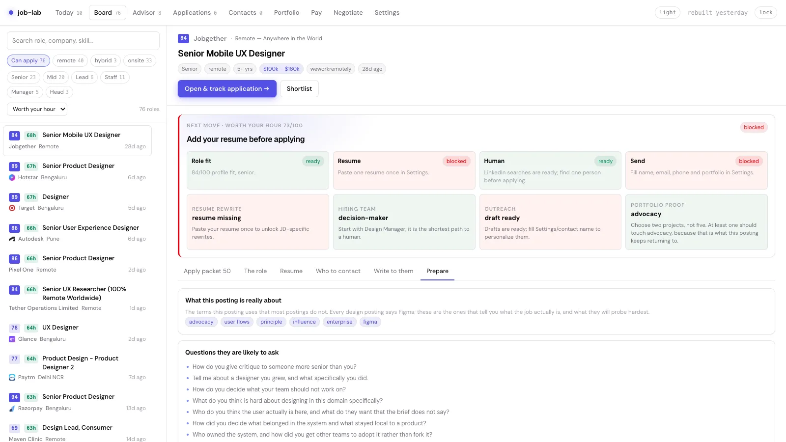
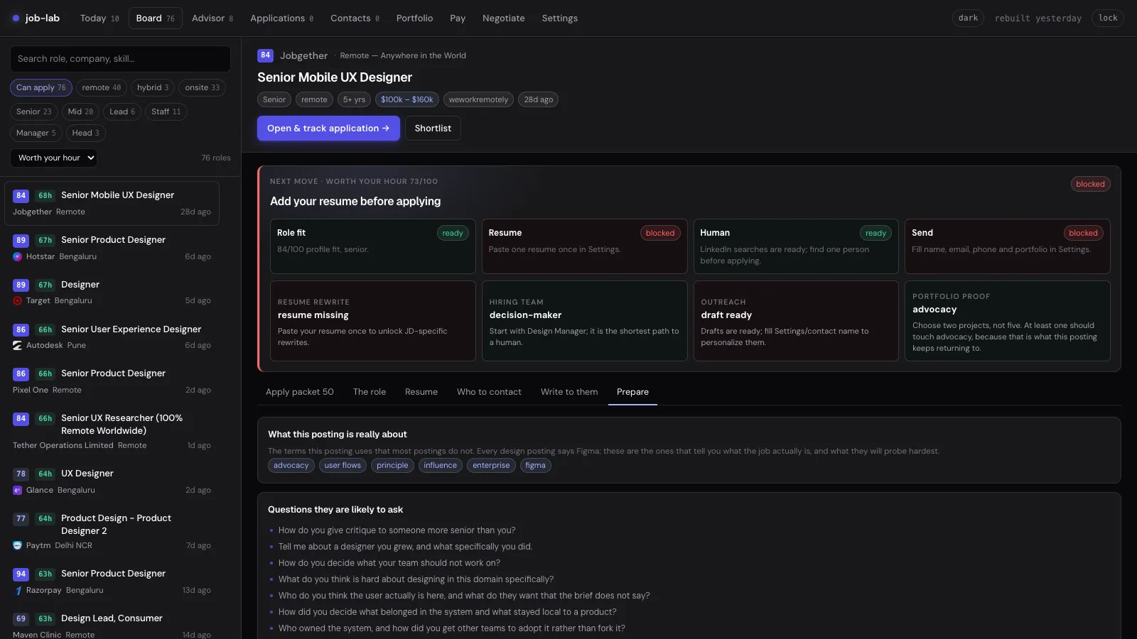
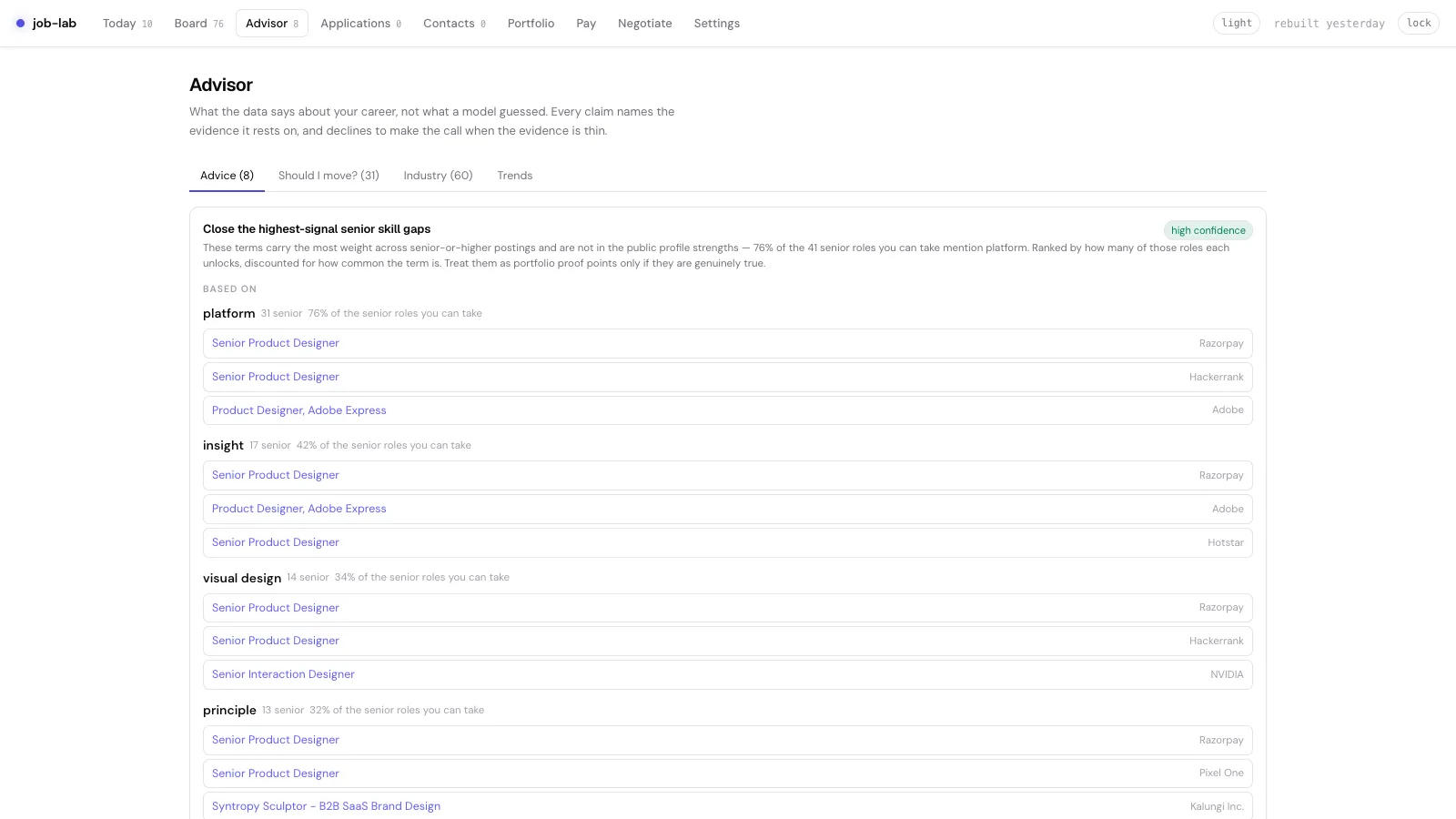
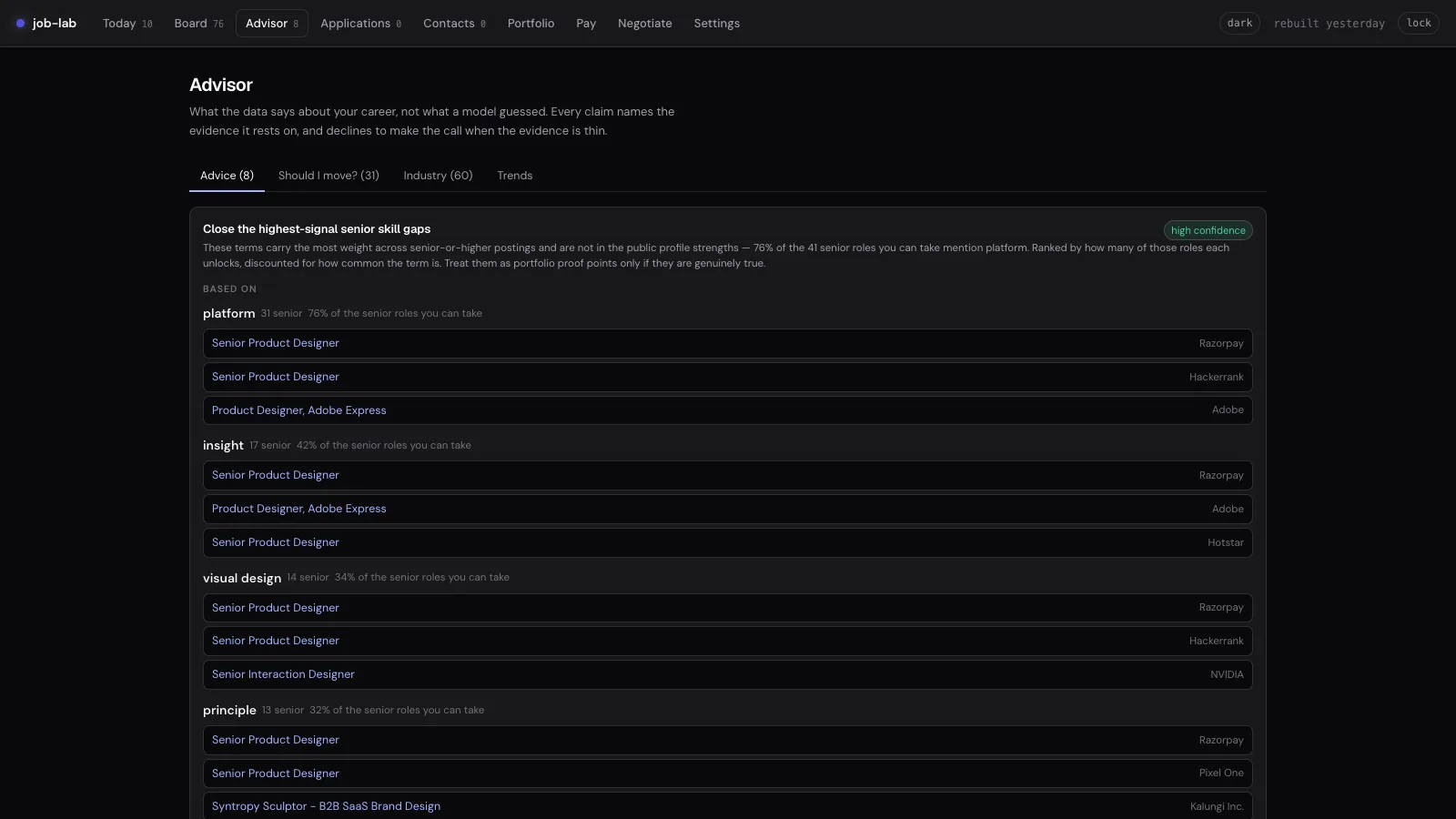
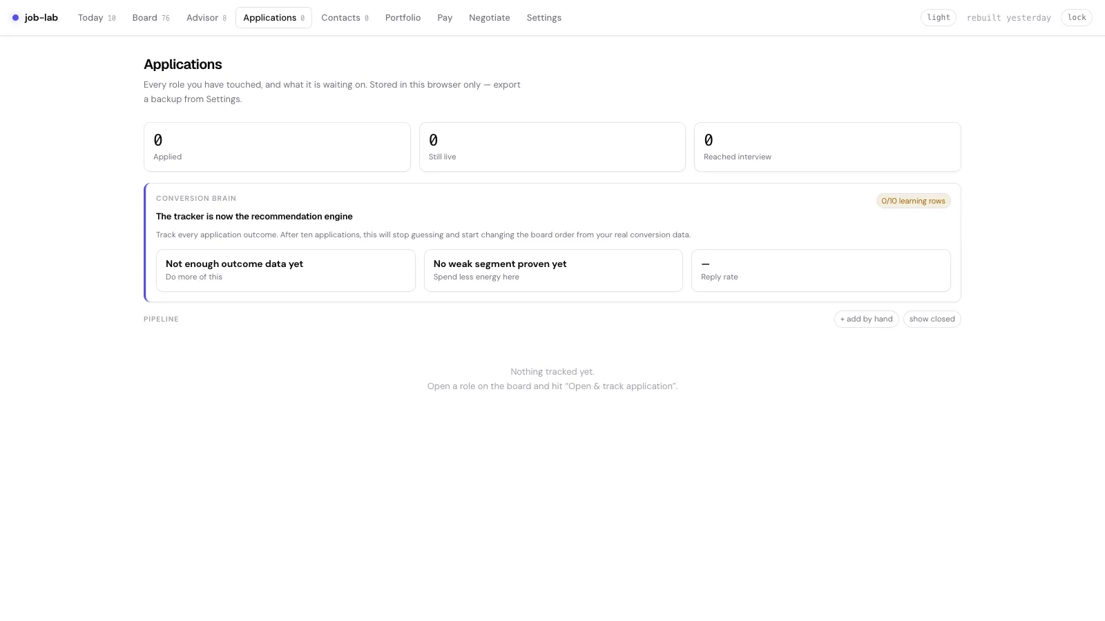
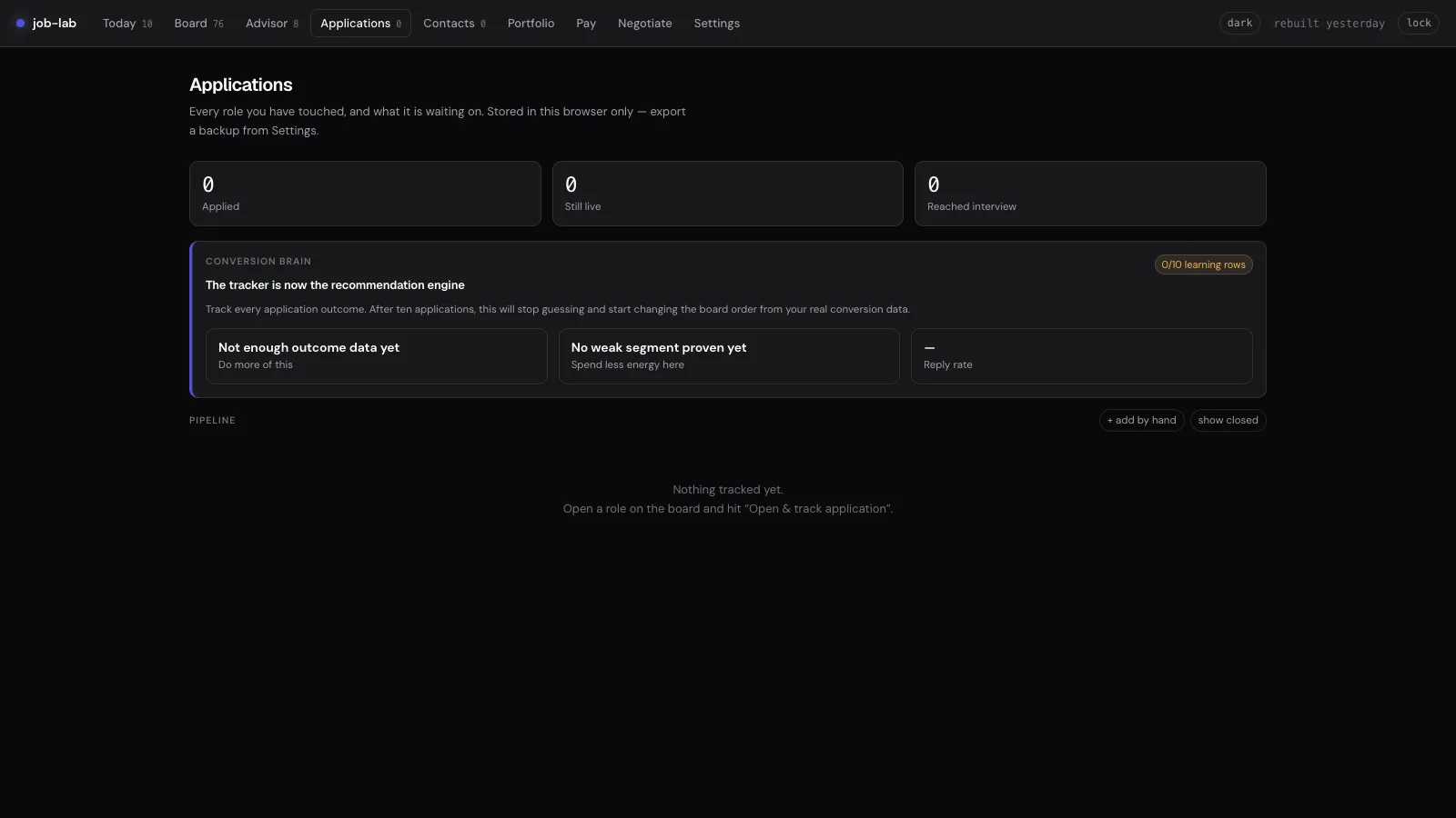
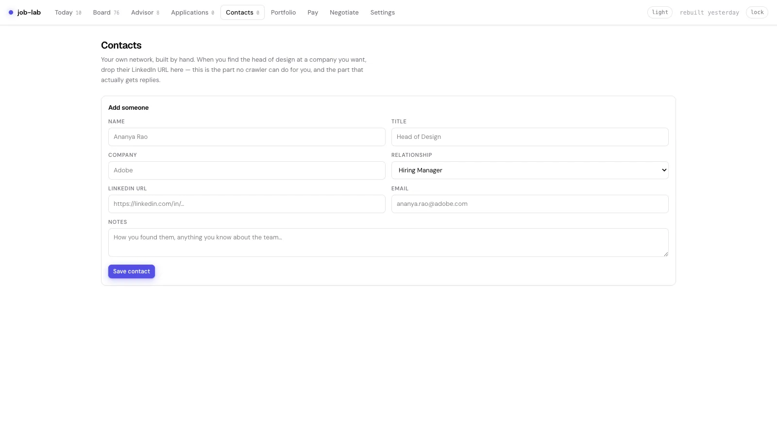
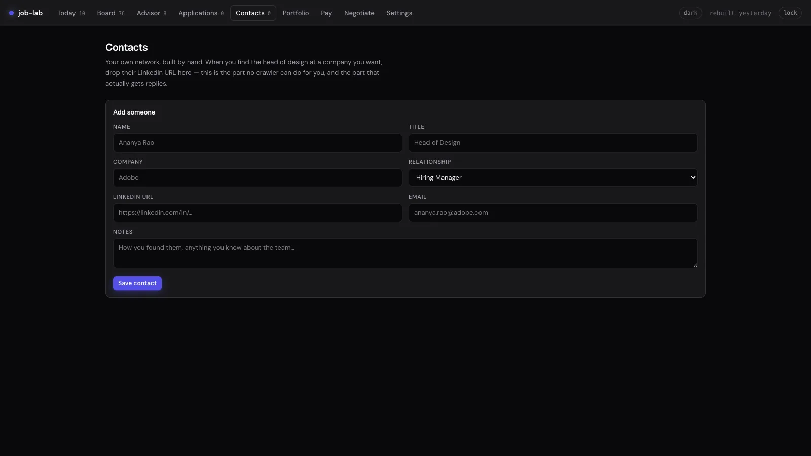
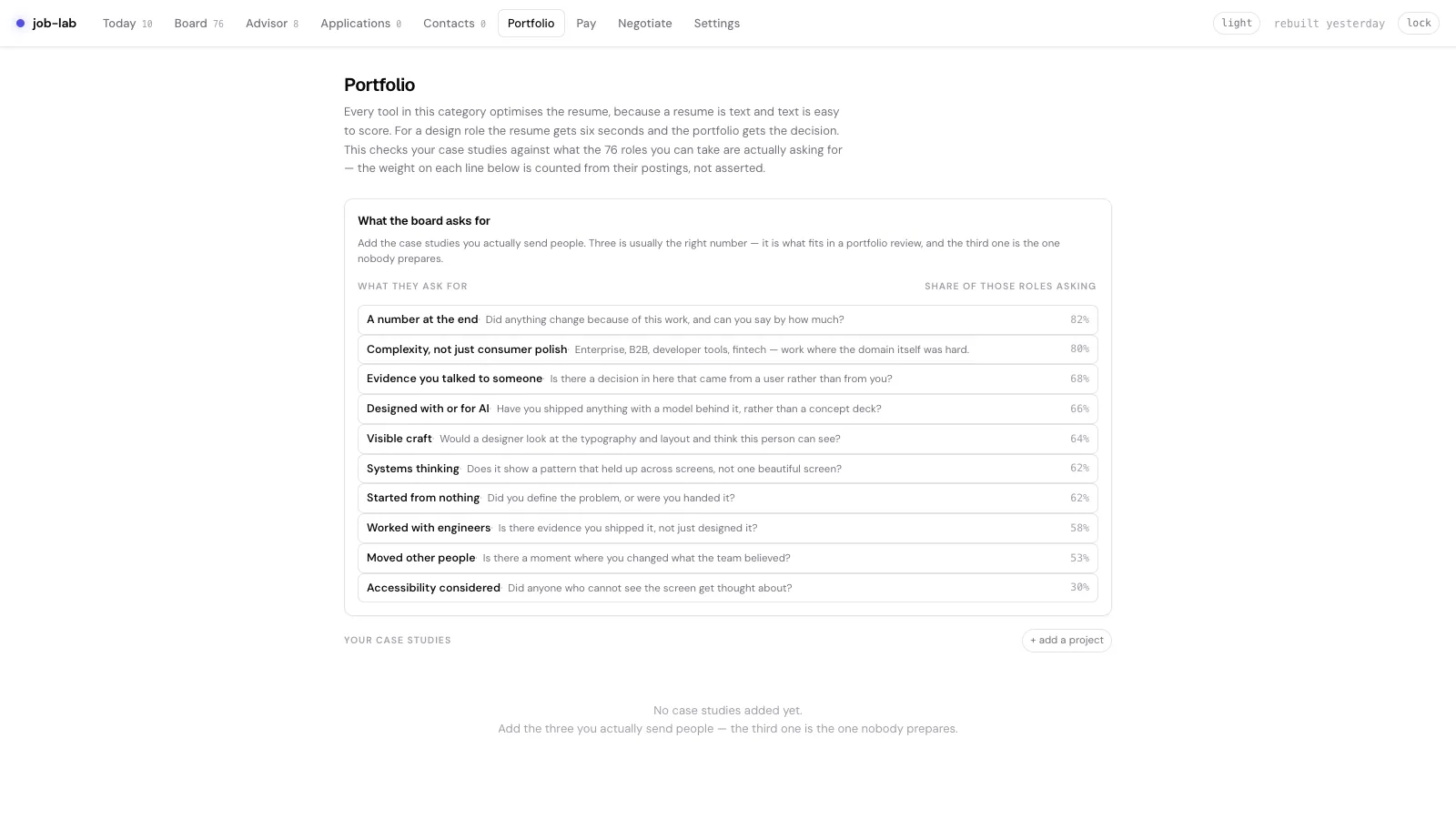
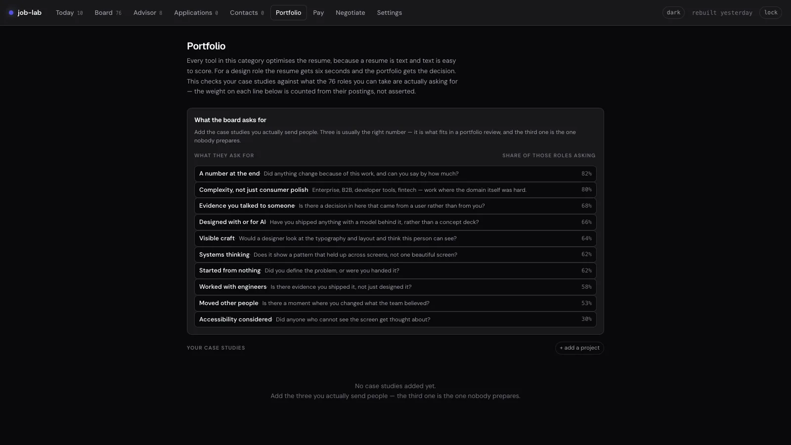
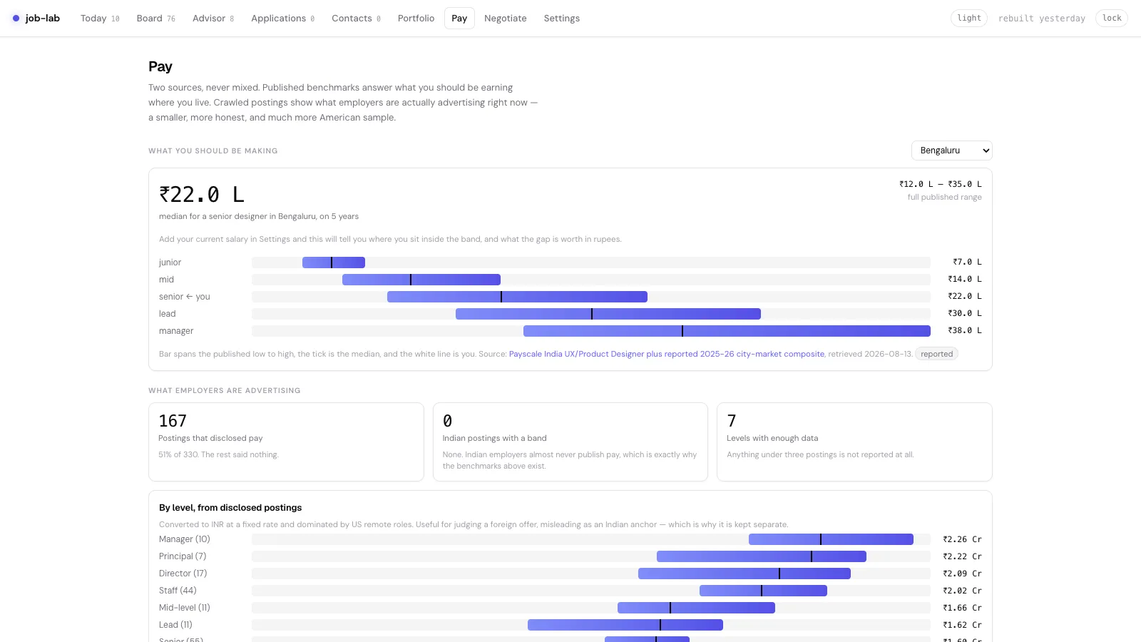
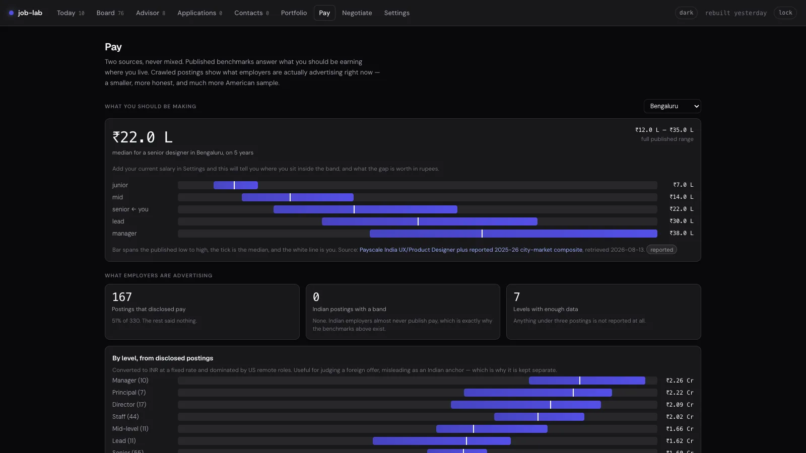
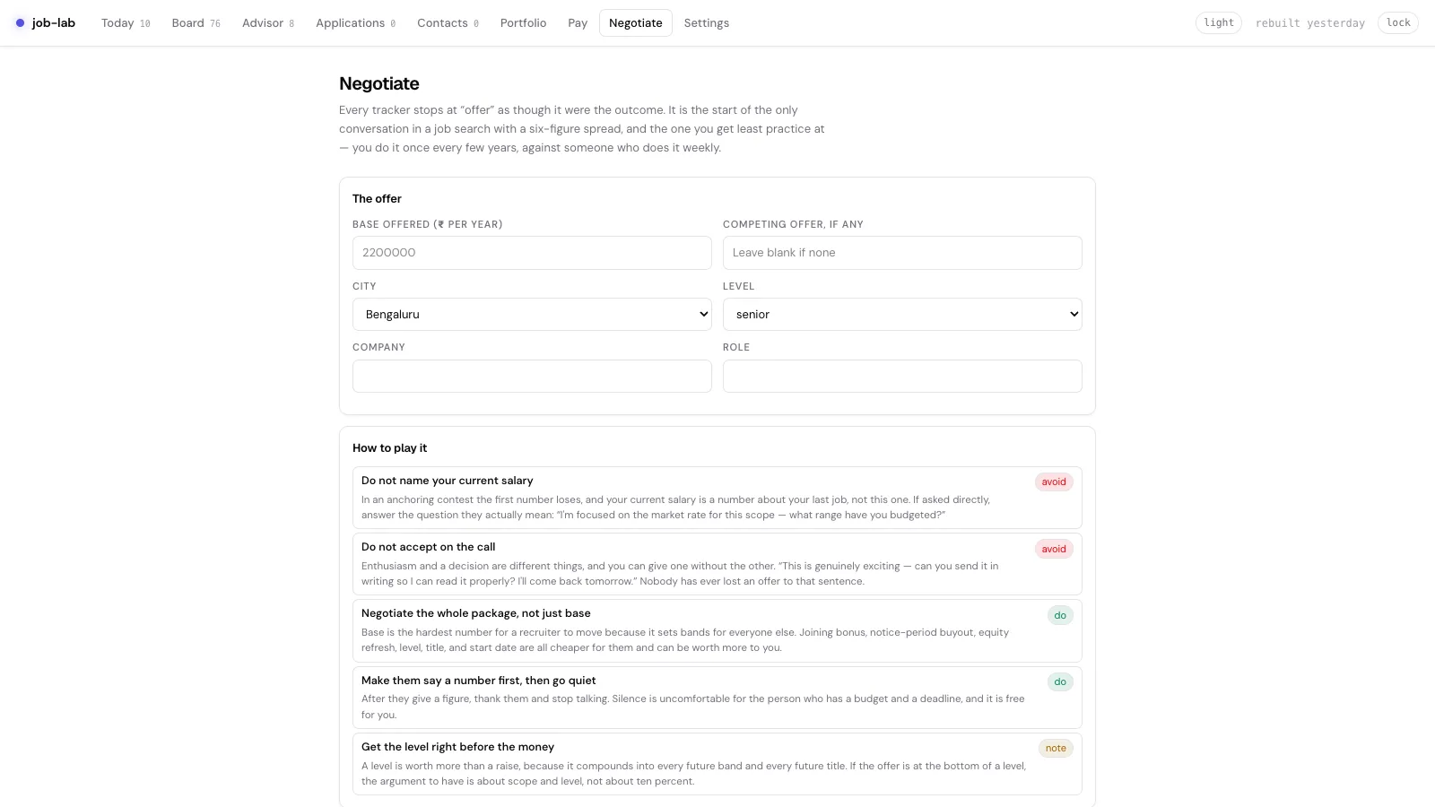
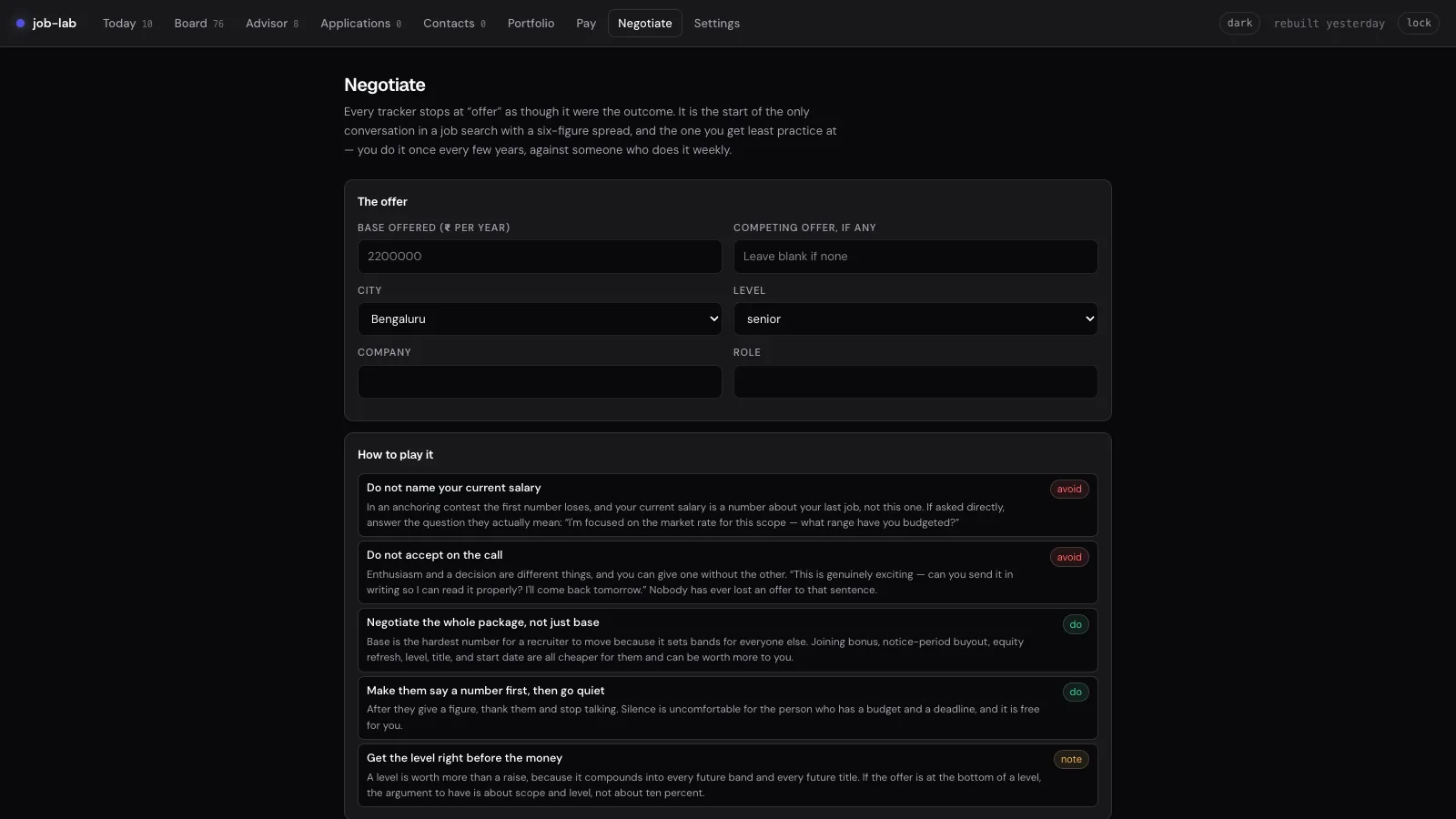
Failure is a designed state too
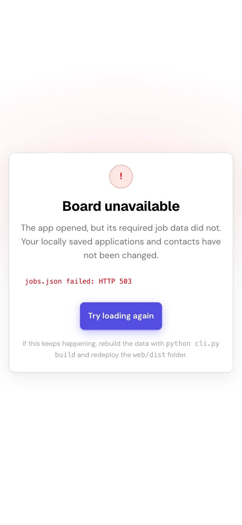
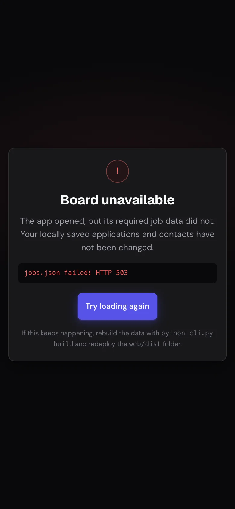
Local-first products still fail. A required job file can go missing, optional evidence can arrive malformed, local storage can reject a write, filters can return nothing, and someone can open a tool before adding a resume or profile. I gave each of those its own state instead of routing them all to one generic empty card. If required data fails, only what can’t be trusted gets blocked. If an optional feed fails, only the affected advice degrades. Local applications and contacts are never touched.
| State | What the interface says | Recovery behavior |
|---|---|---|
| Required board data fails | The Board is unavailable; local applications and contacts were not changed | Retry the failed source without clearing private local state |
| Optional evidence is malformed | The Board still works; the affected Advisor or company evidence names what is missing | Reload that feed and keep the rest of the product usable |
| Search or filters return zero roles | The roles still exist, this view just has no matches | Clear search and filters in one action |
| Resume, profile, or portfolio proof is missing | The relevant packet module is blocked and names the missing evidence | Send the user to the field that enables matching, outreach, or autofill |
| A form or storage write fails | The error stays on the action instead of implying success | Fix the field, retry the write, or reset only the affected local data |
Accessibility changed the structure
The accessibility pass changed structure, not just colors. I added a skip link and landmarks, fixed heading and control names, made map points keyboard-operable, built real dialog and tab behavior, trapped and restored focus, made the list inert behind mobile detail, supported arrow keys across tabs, kept focus visible, added reduced-motion behavior, and kept a readable list as the alternative to the map.
| User need | Implementation evidence | Validation |
|---|---|---|
| Navigate without a pointer | Named buttons, keyboard map points, tab semantics, and logical focus order | Keyboard review across every primary view and all job-detail tabs |
| Keep context through overlays | Focus trap, inert covered content, explicit close and back actions, focus restoration | Mobile detail and More-sheet open and close paths at 320 and 390 pixels |
| Read both visual themes | Semantic tokens for text, muted labels, status tones, focus and action contrast | Light and dark contrast, persistence, and first-paint theme checks |
| Zoom and reflow | Compact cards and local table patterns avoid page-level two-way scrolling | 320-pixel viewport and 200%-equivalent reflow coverage |
| Understand errors and state | Errors name the failed action, keep trustworthy work, and offer a recovery control | Core-data, malformed-feed, empty-result, invalid-form, and storage-state tests |
I tested it against real ATS platforms
I tested against the application platforms people actually hit, and the ways each one breaks: Greenhouse, Lever, Ashby, Workday, SmartRecruiters, iCIMS, Workable, and generic employer forms. That changed the product. Autofill can prepare you. It shouldn’t pretend every ATS behaves the same, and it never auto-submits.
I also wrote browser tests for the live app. The desktop smoke test covers the political map, split-view detail, application tabs, and every top-level workflow. The mobile suite runs the whole product at 390 × 844 and 320 × 720: navigation, list to detail and back, every detail tab, empty states, invalid forms, required-data failure, malformed nested data, and optional-feed degradation. Accessibility checks cover keyboard and semantics, contrast, reduced motion, and 200%-equivalent reflow. After deployment, a production smoke test confirmed mobile navigation, Today, no horizontal overflow, and zero page errors.
Rendering is not proof
If the claim is “this helps a designer apply better,” a screen that renders proves nothing. The workflows have to survive missing data, narrow screens, keyboard use, both themes, and the trip back from a focused task.
What this proves, and what it doesn’t yet
I built this alone, so it shows how I own a product end to end: the trade-offs, the implementation, and a working deployed system. It doesn’t show team leadership, and it is too early for placement or conversion numbers. The next layer measures exactly that: time from finding a role to deciding on it, packet completion, application-to-reply rate, interview rate, and whether the daily cap cuts weak applications without cutting opportunities.
Shipped is not the same as impact
Browser tests prove the product works. Only real use over time proves it improves a job search. Knowing the difference is part of the job.
Blunt feedback made it better
The useful feedback was blunt: the map looked bad, the India treatment was wrong, mobile felt like a squeezed desktop, and a pretty happy path was not enough. It pushed the design from a visual concept into a full operating system: accepted map context, source credibility, ATS readiness, a task-first mobile layout, accessibility, recovery, outreach, interview prep, outcome learning, and a burnout guard.
The takeaway
job-lab covers my whole range: product framing, public-data architecture, scoring models, interaction design, visual systems, local-first privacy, theming, and real browser testing. The board isn’t the product. The product is the system that tells you what to do next.