Problem
Cost only shows up once the meter runs. Some people get surprised by the bill. Others stop starting big tasks.
Runable is an AI agent that spends credits on every task. The brief asked me to help people predict the cost. I pushed back: they need a ceiling. The most a task can use, shown before it starts, and never crossed without asking.
60-second brief · One-day design challenge
People were not missing a number. They were missing a promise. Agents retry, detour, and loop, so any estimate will sometimes be wrong. When it is, the estimate is the surprise.
The brief asked for a better prediction. I gave it a limit Runable enforces, so going past it is a question, not a bill.
Outcome
A clickable prototype built on Runable’s own plan card, Usage panel, and model menu.
Cost only shows up once the meter runs. Some people get surprised by the bill. Others stop starting big tasks.
Show the most a big task can use before it starts, then stop and ask before crossing it.
A working prototype, stress-tested with simulated users. No real users yet.
I owned the framing, the design calls, and the prototype. AI helped me explore, critique, and build.
On Runable, a quick question costs a few credits and a website can cost thousands. Today you only see that cost in a Usage panel after the work has started. It is a meter with no ceiling.
Public reviews filled in the rest. Two thousand free credits gone in four website prompts. The last 30% of a project quietly eating the budget. Two kinds of people get hurt at the same moment, when they press Send: the ones who get surprised, and the ones who stop trying big tasks.
The obvious answer is a price tag: estimate the cost while you type. With AI, I mapped 38 directions and scored them. Everything that only predicted failed the same way. An agent hits a broken payment step, retries twice, and the estimate is wrong the moment it does.
The reframe came out of a lot of back-and-forth: stop predicting, start promising. In my scoring, adding a ceiling helped every direction about three times more than a sharper estimate did.
Dropped. Each one breaks the moment the agent takes a turn.
Kept. A limit that is enforced can’t be wrong.
Chapter 03The quote
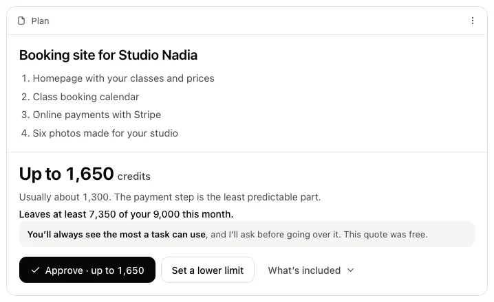
After Send, Runable asks only the questions that change the cost. Then Plan mode’s card gets one number: up to 6,250 credits. The maximum is the only number Runable can guarantee, so it leads. The honest middle sits beside it as a quiet usually about 5,500.
What it cost
A maximum can look scarier than an average. Leading with usually would feel friendlier, but usually is the number that breaks. Real people reading this card is the first test I’d run.
Proof
The first version’s lines added up to 6,400 under a 6,250 headline. A review caught it; every sum now matches its headline.
Chapter 04The pause
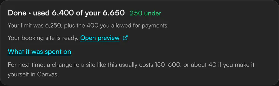
Payments fail twice, so finishing would cross the limit. The agent waits for in-flight work to settle, says what works and what does not, and shows the arithmetic: 3,400 used, 2,850 left, finishing needs up to 3,250. So it asks for exactly 400 more.
What it cost
A pause interrupts. In my simulation, about one run in nine hit one. Any more often than that, and people learn to click Allow without reading.
Proof
A simulated five-second test read up to 2,050 as the size of the increase. Naming the difference, allow 400 more, fixed the misread.
Chapter 05Rebuild
I built the first prototype from old blog screenshots: a light interface, a header balance, invented model names. Then I took my own screenshots of the live app. Three pieces were already there: Plan mode asks before building, a Usage panel counts credits with no ceiling, and a model menu swings cost from 1× to 90.8× without saying what Auto picked.
What it cost
Matching the live app meant throwing away a finished first build, late in the process.
Proof
The design became three changes to things Runable already ships, instead of a new feature people would have to learn.
One flow carries the idea. These six show the same ceiling and the same pause in a running site total, a free plan, a task nobody can estimate, a quick question, a repeated task, and outside the app entirely.
AI was my thinking partner and my builder the whole way. It is really good at breadth and speed. The breadth is also where I lost the plot.
Why it still took me
AI mapped 38 directions fast. Deciding that a ceiling mattered more than a sharper estimate is the call this whole case stands on, and it was mine.
Runable passed on it. They said the work was good, but they were looking for a different kind of designer: they felt I leaned on AI too much. On this brief, they had a point. The reframe, the cuts, and the rebuild on the real app were real decisions, and the idea holds up. But the volume hid the thinking: 38 directions, seven scenarios, a 36-slide deck, and a narrated video, for a one-day brief.
AI made it easy to add. The job was to subtract.
The pause is the idea. The free plan, the weekly promo, and Slack were footnotes I let turn into chapters.
My own words before any AI draft. The reasoning leads, and the build follows it.
Every test here was simulated. One real person misreading “up to 6,250” as a price would have taught me more.
A 36-slide deck and a four-minute video answered a question nobody asked. The brief asked for judgment, not coverage.
Plan’s card, the Usage panel, and the model menu. Nothing new to learn.
The pause before crossing the limit, asking only for the difference.
Stress-tested with simulated users and 60,000 simulated runs. Not with people, yet.
What I can and can’t claim Concept work for a take-home. Nothing here shipped, and no real user has tested it yet. See the decision behind it
Not a better guess. A limit that holds.