Two readers, half the scroll.
I redesigned and rebuilt a 214-page site that helps students from Germany, Austria and Switzerland study medicine across Europe. Every page answers two people at once, the student and the parent paying, so I gave every page one system and one action per screen.
Problem
Every page talks to two readers.
The 17-year-old wants the adventure; the parent paying wants safety. The old site had grown page by page for years: cartoon doctors on the homepage, long text pages, a different pattern on every page. My job was to redesign and rebuild all of it in code, beside the lead designer.

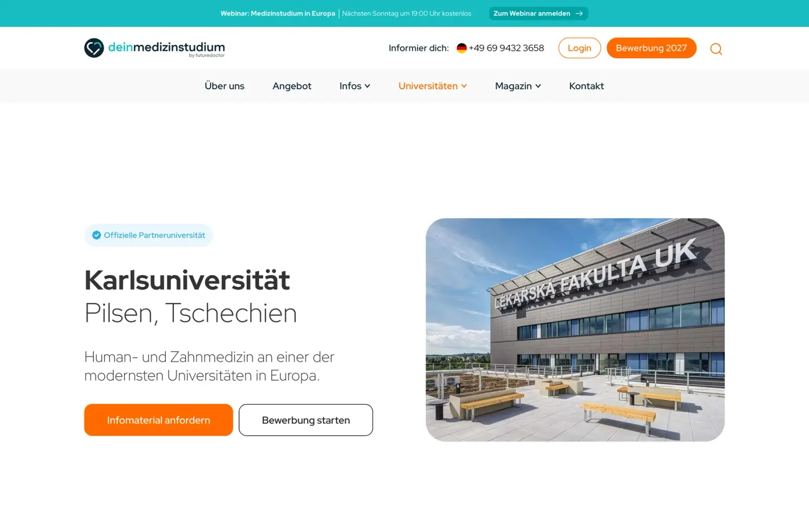
What I found
A prototype you could read as the student or as the parent.
Before any visual design, I moved the old site’s content and the data for 23 universities into a clickable prototype with the review built in: read a page as the student or as the parent, move today’s date so the deadlines change, and see the open questions on the page. The parent compares universities in five tabs, so every page had to scan.
What it cost
A prototype that looks finished invites polish before the structure is right. The first reviews were about structure only, on purpose.
Proof
Every page of the old site had a place in the new structure before any visual design started.
See the second build
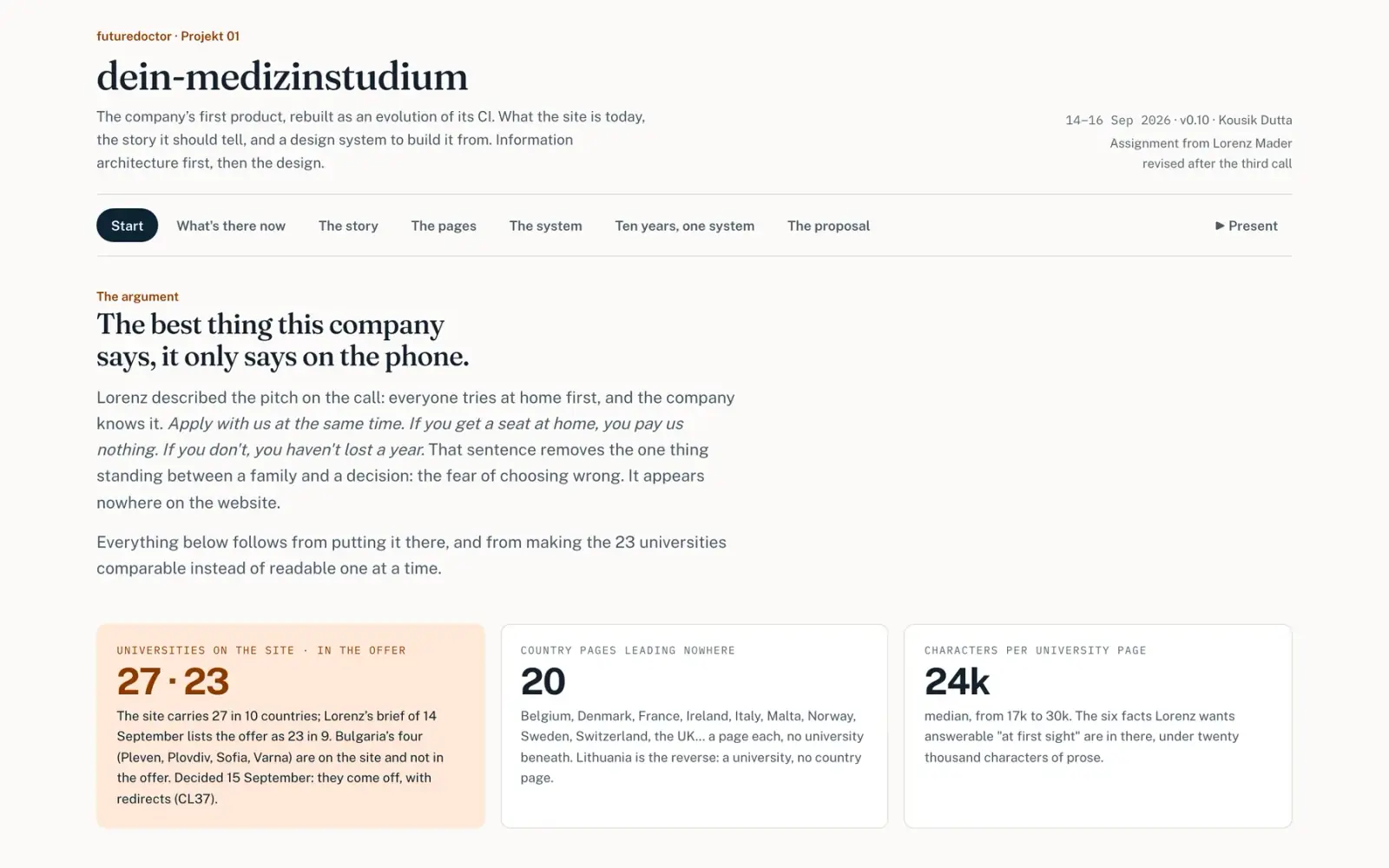

What I decided
Half the scroll, nothing deleted.
The university page still looked complex. I rebuilt every section on one skeleton: the answer as the heading, one sentence of context, one picture, one way to read more. Secondary detail folded. No sentence went, on all 23.
What it cost
More of the page sits behind a tap, so a reader who wants everything has to open it.
Proof
Same content, about half the length on both screens, and half the words before anything is opened.
See the page on its side and the final page
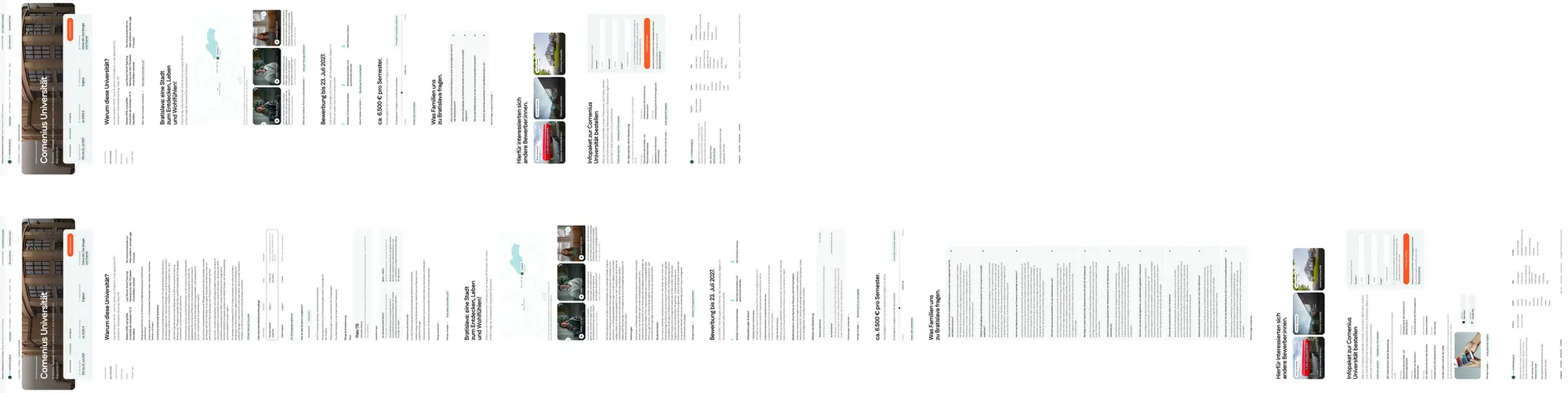

pixels of scroll on a desktop, down from 12,521
pixels of scroll on a phone, down from 14,430
words before opening anything, down from 1,171
One university, the same content, measured on a staging build.
What I decided
17 directions, one look.
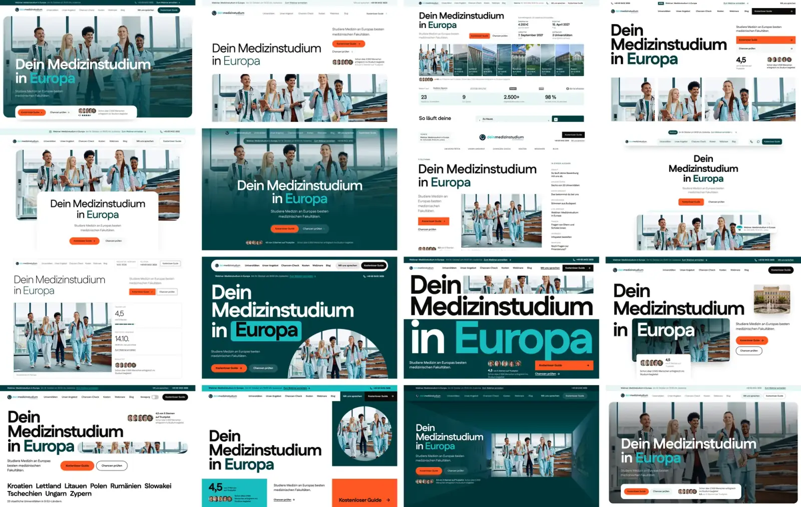
No moodboards, no Figma. I built 15 complete directions in code, the same content side by side. The lead picked a mix of three, then said too much blue, so I made a calmer 17th: white, rounded photo plates, one orange action.
What it cost
15 directions is a lot to review. It only worked because they were side by side, same content, same sections.
Proof
One round of picking settled the look for the rest of the project.
See direction 17 and the variants
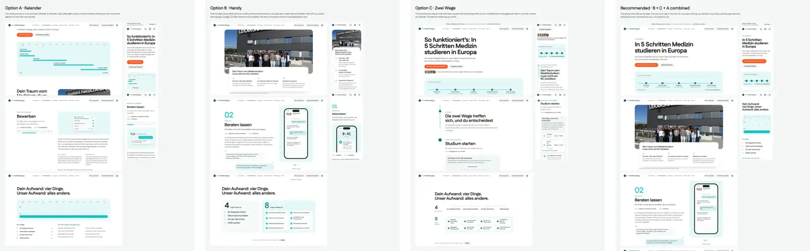
- Every homepage section came in versions he could switch in the browser, and when refining the process page only moved blocks, I built four concepts instead.



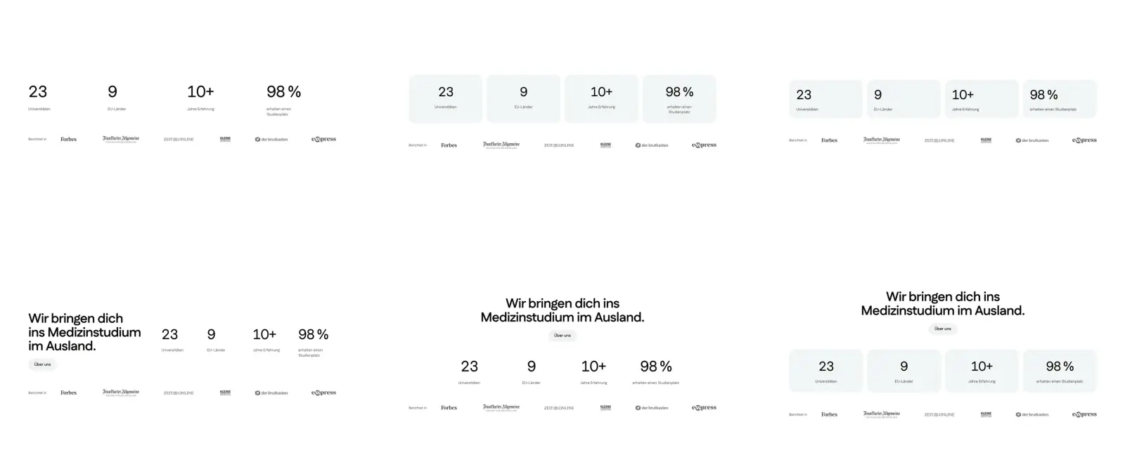
What I decided
One system, not a pattern per page.
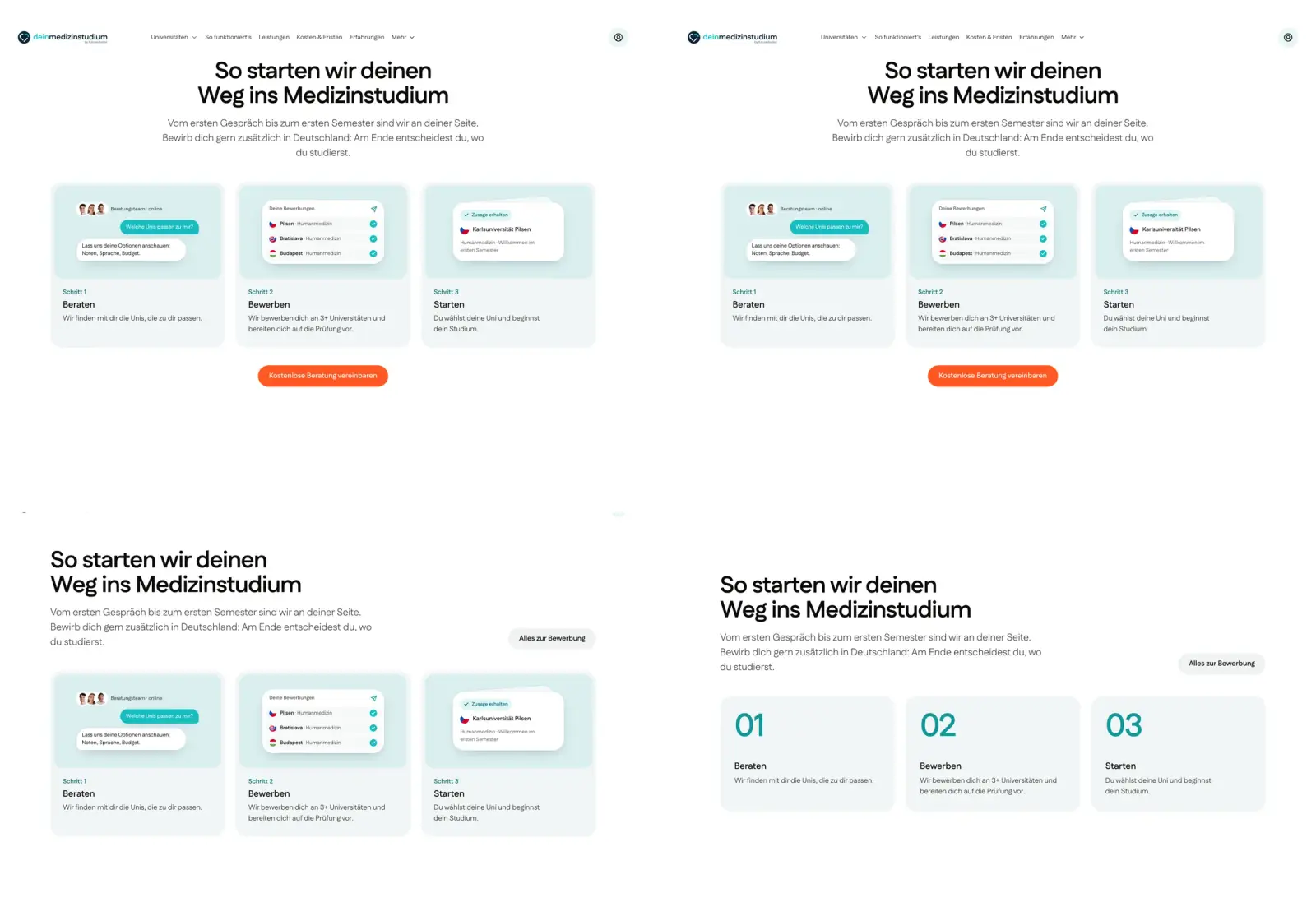
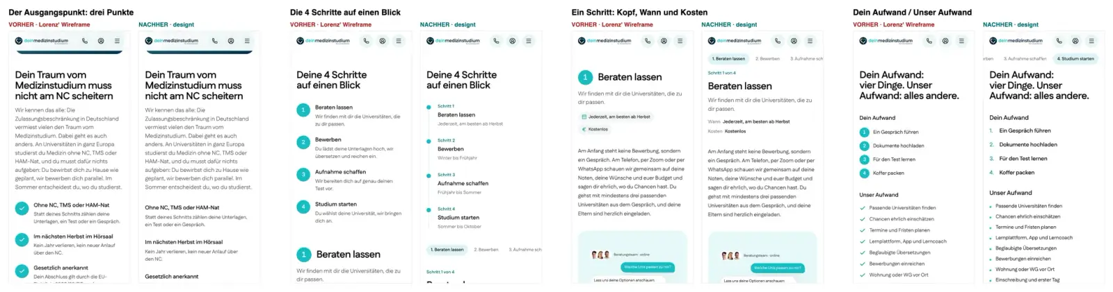
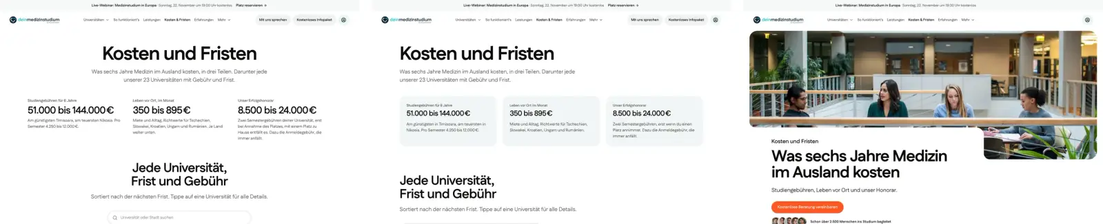
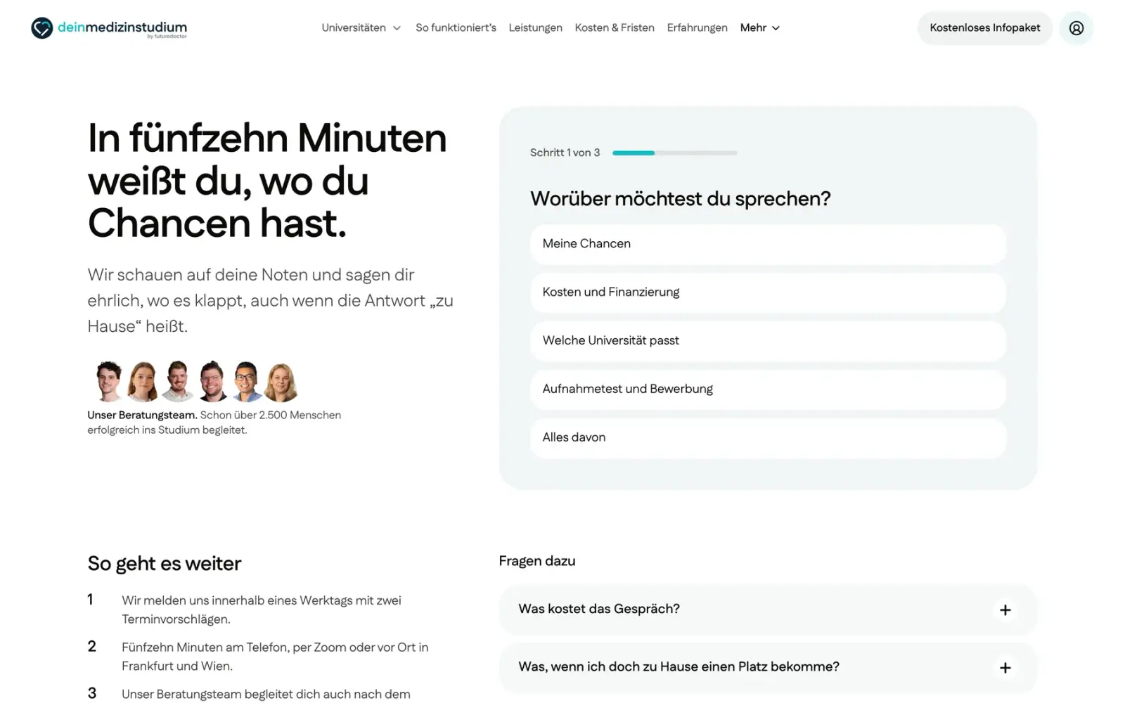
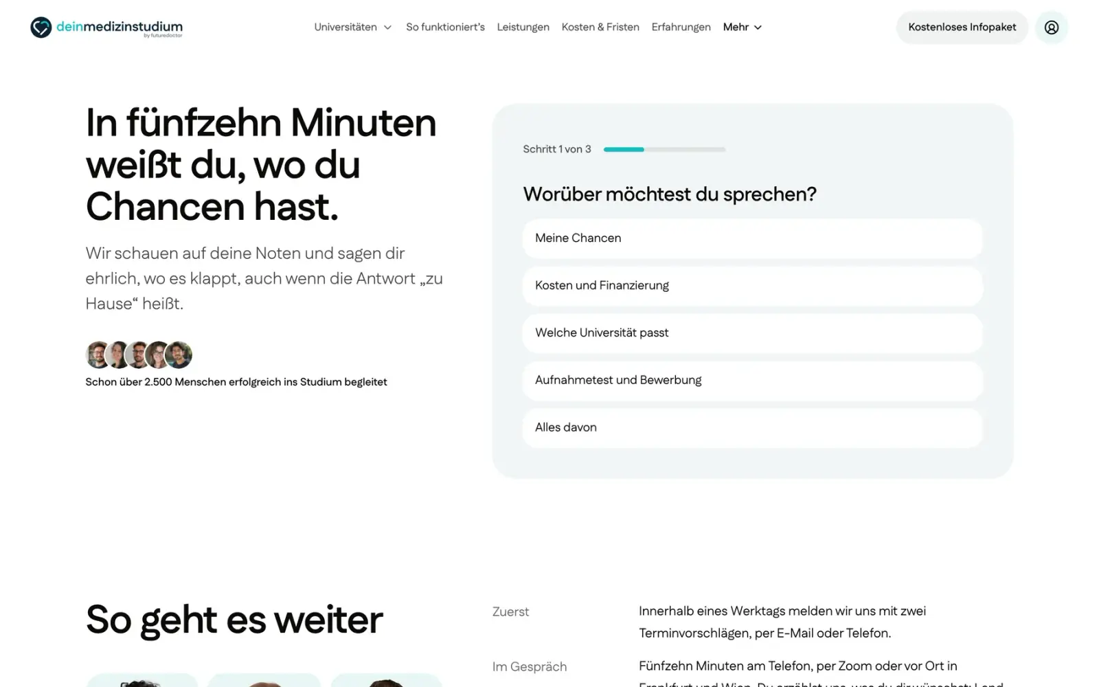
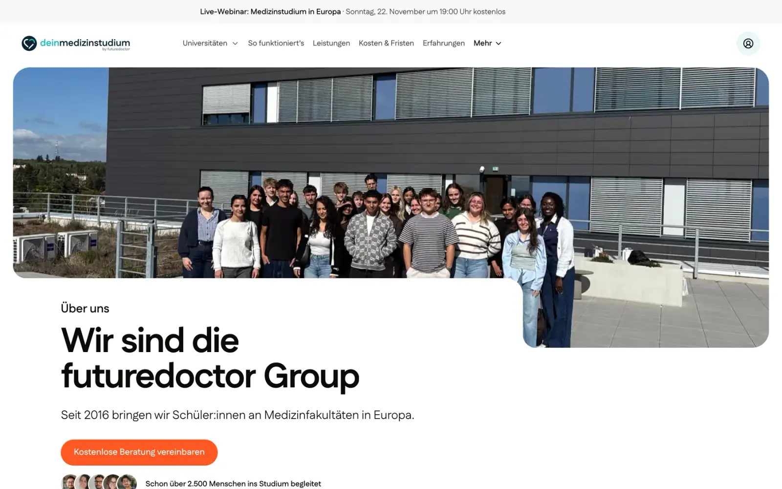
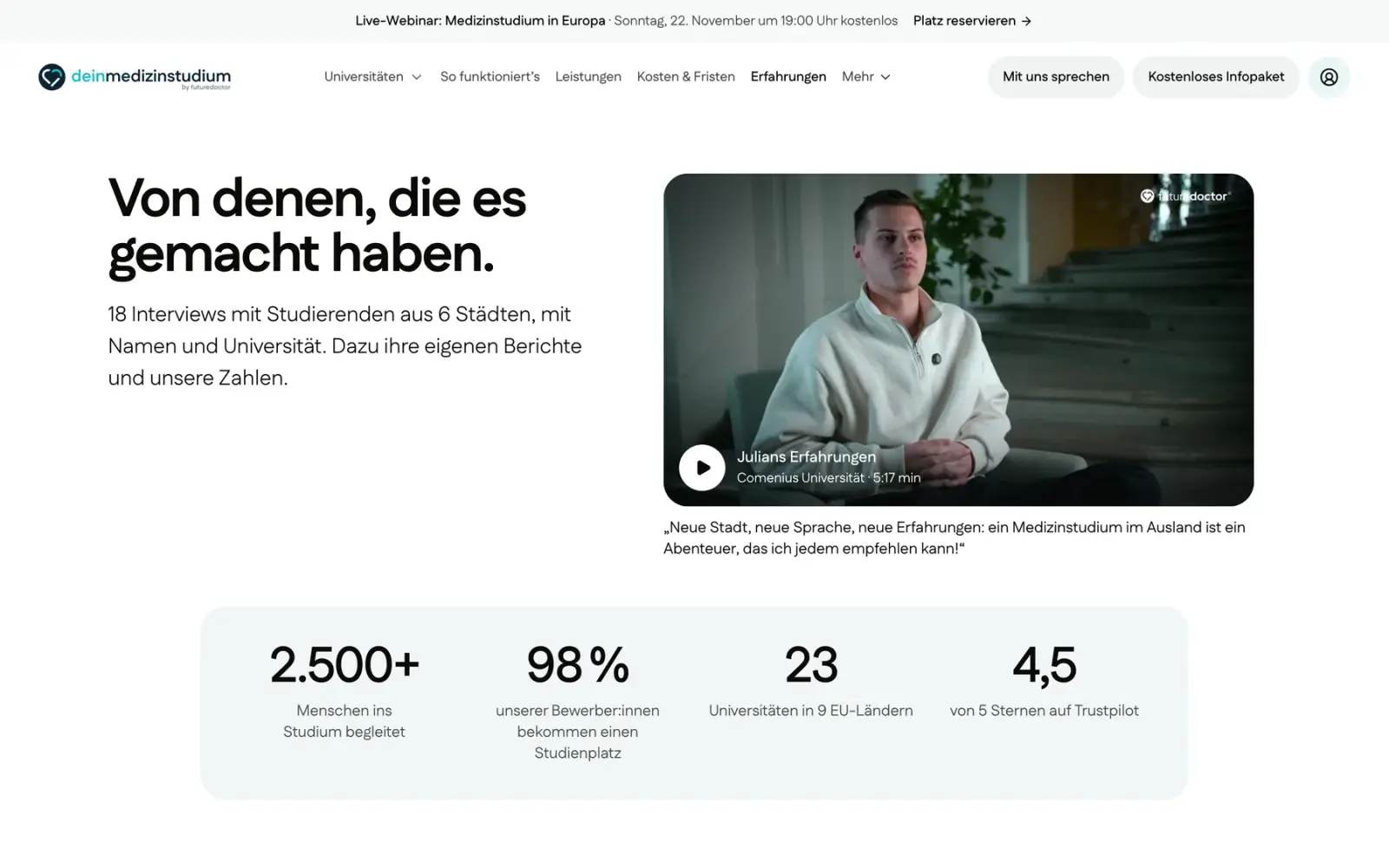
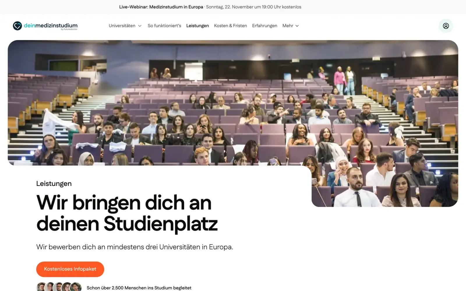
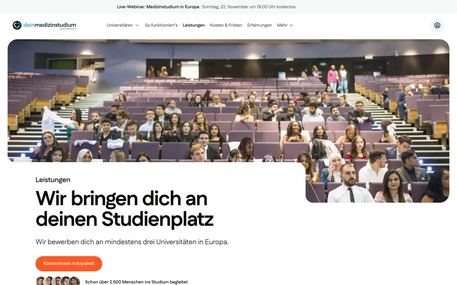
Pages had grown their own patterns: four layouts for the same questions, a new testimonial shape on almost every page, text-only and split heroes. I gave each page one owner, built only from shared parts, and after four rounds every inner page got one hero: the homepage’s photo plate with a white card cut into its foot.
What it cost
One owner per page is slower than changing many pages at once, and every other page waited through four rounds of the hero.
Proof
One hero system now runs on every inner page, at every width.
See every before and after
- FAQs
Four layouts for the same questions became one.
- Quotes
A new testimonial shape on almost every page became two: written and film.
- Heroes
Text-only and split heroes on the inner pages became one hero system, built from the homepage.





What shipped
Every page type, rebuilt in code.
The phone came first in every review, so here is the site on one.

The walk on a phone, then home, a university, the process, costs.
Proof
A 285-issue audit, fixed in five passes, then every page checked at five widths. A cold read of the production build still found a photo of the wrong building and one fee explained two ways. Every page in the sitemap loaded on the final build.
- Pages
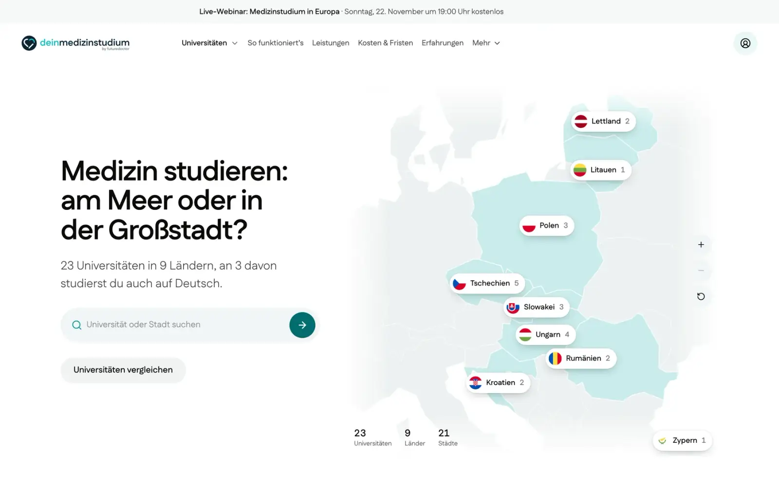
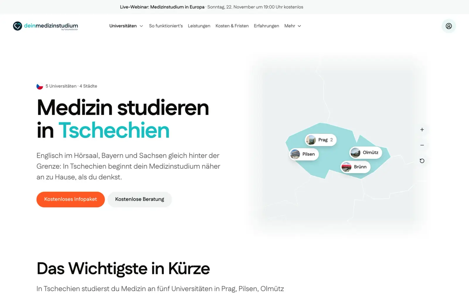
The homepage, 23 university pages, 9 country pages, the process, offer, cost and question pages, testimonials, a video library, the forms, the blog and the webinars: 214 pages in all.
- Redirects
Every one of the 324 old addresses answers with a permanent redirect, so search rankings move with the content.
- Forms
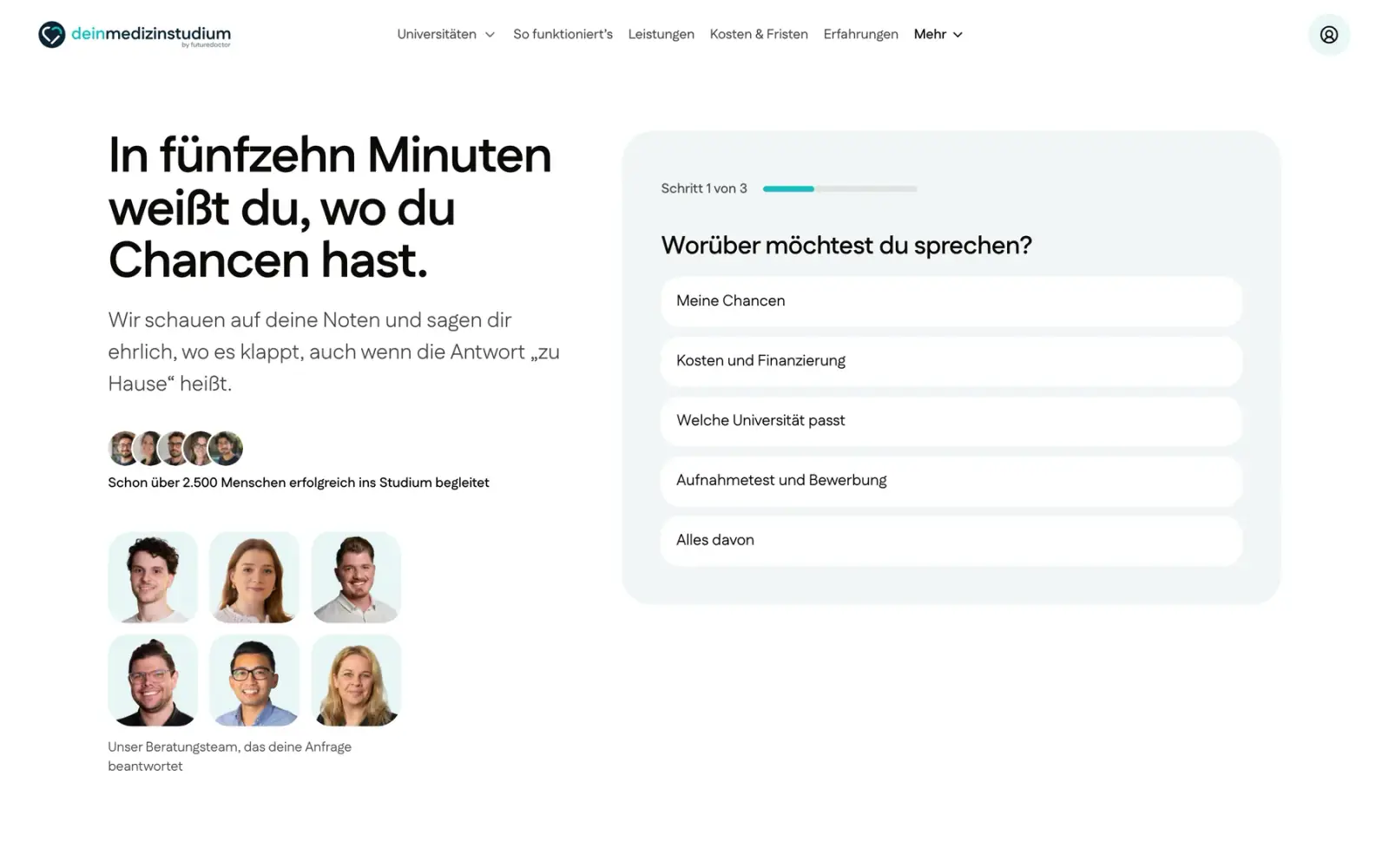
Short, one column, one question at a time where it helps. When a lead can’t be sent, the form says so and gives a phone number instead of failing quietly.
- Consent
Video and analytics load only after a yes, and a visitor can change the answer from the footer.
- Access
Zero contrast failures in axe after the accessibility pass, a skip link, and focus that always shows.
See every page type





Looking back
Next time, one system from day one.
The fastest weeks were the ones where I explored wide and then cut hard. The slowest were the ones where many pages changed at once; one owner per page and shared parts fixed it, and I would start that way.
Beyond the brief
The site hasn’t launched yet, so I have no numbers from real visitors.
Claude Code wrote most of the code, built the directions and variants, and ran the checks. I set the direction, chose between versions and judged every screen.